All about the use and structure of pitch decks

What is a pitch deck?
The term pitch deck stands for a short, very condensed presentation designed to convince decision-makers of an idea, product, project, etc. in a relatively short space of time.
Start-ups in particular use pitch decks in the first stages of making contact with investors. Founders are in fierce competition for investors. The pitch deck is a way to stand out from the competition. It should generate enthusiasm and demonstrate innovative strength.
A pitch deck is therefore above all an emotional instrument with which to win over people as supporters and mentors. Successful pitch decks manage to provide just the right amount of information and at the same time convey a strong vision. A good dramaturgical structure, a surprising arc of suspense and a convincing story are more important in this phase of the business relationship than detailed analyses and business plans.
The pitch deck is the digital document that supports a presentation. However, pitch decks are often also sent to decision-makers. In this case, the slides must also work without a presentation.
Who needs a pitch deck?
A pitch deck is mandatory for start-ups and founders. It belongs in the toolbox just like other formats, e.g. the elevator pitch, the executive summery or the business plan.
- The elevator pitch, a purely oral presentation format lasting a maximum of 2 minutes, is the first teaser, so to speak. The aim here is to attract the attention of investors.
- The pitch deck presentation focuses on the enthusiasm for the idea. However, it should also show that the idea has a solid basis.
- The business plan provides a detailed list of the financial requirements, the planned expenditure and the calculation of the break-even point. The most important key business figures from the business plan are summarized in the executive summary.
The pitch deck is therefore in good company with other presentation materials and fulfills its own role in this context. It serves to arouse, deepen and maintain the interest of investors. The aim is to reach the next round, where investors take the time to find out more about a business idea and the business options.
But the pitch deck also has its uses outside the start-up scene. In business, there are many presentation situations with similar conditions. Pitch decks are always an advantage when you are in competition or have a narrow time window and when you need to find supporters for your ideas, e.g. for
- Presenting ideas to decision-makers
- Presentations as part of innovation management
- Internal project competitions
- Kick-offs for new projects
- Keynote speeches
In fact, working on a pitch deck can help in many other situations. Because once you have succeeded in presenting the core of a plan, project or idea on a limited number of slides, you are usually “ready to speak” and well prepared for talks and discussion rounds.
What is important in a pitch deck?
1. Convey clear messages
As mentioned at the beginning, time is short in pitch presentations. If you have to get to the heart of your idea in the shortest possible time, clear and concise formulations are important.
- Write in bullet points or short sentences.
Use positive language. For example, write about challenges instead of hurdles. - Use active instead of passive sentences.
- Choose easy-to-understand terms instead of technical jargon.
- Describe your product or business idea not in terms of technical functions, but in terms of the effect it achieves.
- For example, try to use a comparison to express the relevance of your idea rather than a “We are X for Y” description.
- Work out clearly what sets you apart from the competition: we are faster than x, better than y and more innovative than z.
2. Motivate people
The primary goal of a pitch deck is to get people excited about a business idea and motivate them to take action that will help you realize it. You want to win over your audience as investors, mentors, budget managers, employees, etc. To achieve this, the pitch deck needs a convincing flow, the literal red thread of the argumentation. A logical and comprehensible structure of the information makes it easy for the audience to follow you. Storytelling is a proven method of captivating your audience emotionally. Tell your personal story of how you came up with the idea, describe an observation you have made or start with a vivid problem that you want to solve.
Read our blog article Storytelling in presentations to find out how you can use storytelling not only in pitch decks, but in presentations in general.
3. Build trust
If you want to find partners or supporters, you need to build trust. You can do this with a professional presentation and a confident appearance.
- Make sure your presentation is error-free. Have all slides proofread by someone who is not familiar with the topic and can also point out any inconsistencies.
- Choose an appealing design for your slides. If you are presenting a new business idea, you have probably already thought about a logo and a corporate design. The pitch deck is already a first test to visually implement your brand identity. Choose uniform fonts, colors that match your brand claim, a consistent slide structure with firmly aligned elements and the same spacing and positions. Read more about how to format presentations here: Formatting presentations made easy
- The following applies to the pitch presentation itself: Do not read out slide texts, but deliver your presentation freely. This proves that you have internalized your idea and thought it through very well. You will appear more convincing overall.
- Prepare yourself for follow-up questions and discussions. Have arguments to hand with which you can immediately counter any doubts that may arise. You should also know your most important key figures and KPIs inside out to signal that your ideas have really been thought through.
- Practice your presentation in front of an audience in advance. Ask friends or colleagues to give you constructive feedback.
How is a pitch deck structured?
Although there are different ways to convey your idea, certain information is mandatory. As a rule, pitch decks follow a more or less fixed schedule that has proven itself in the past. It is worth taking a look at pitch decks from today’s successful companies. You will notice that these pitch decks are very different and yet have a similar structure.
An example of a pitch deck:
Title slide
This slide is used to welcome your audience. It should bear your logo as the sender. As this slide may already be visible before your presentation begins, an attention-grabbing headline can be used to increase the suspense. Further tips for the title slide can be found in our blog article What belongs on the PowerPoint title slide?

The problem
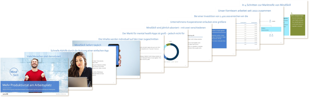
On this slide, you describe a critical starting point: a situation that you want to improve or a problem for which you have a solution. It is important to emphasize the urgency and relevance. Figures can be helpful here, e.g. the number of people affected or the amount of time the problem costs.
The solution
This slide is about your business idea, i.e. the very specific solution to the problem described above. It is important that you do not get lost in details at this point, but describe the effect that you will achieve with your solution. Explain what your customers will get out of your product.
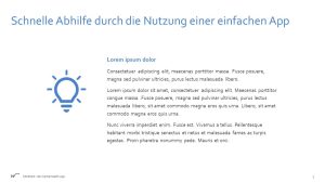
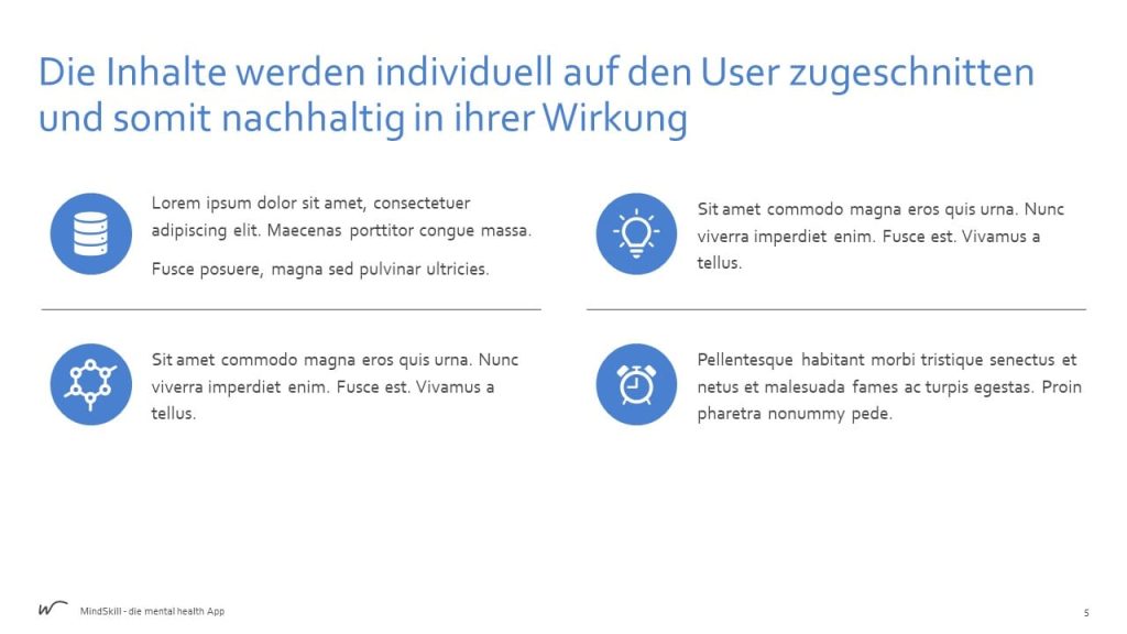
The product presentation
Now go into more detail about your product/service. For example, with informative pictures or a demo. Is there perhaps already a prototype? Explain the most important functions and benefits. If available, include feedback from test users or testimonials to underline the quality.
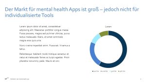
The market
Now make a well-founded assessment of how big the market is for your product. Who are the potential customers and how many are there? What other competitors are there and how does your solution differ from others? On this slide, you should highlight the opportunities and challenges in your market environment.
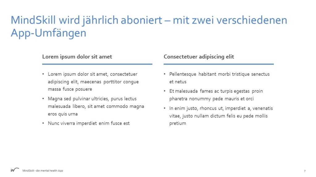
The business model
On this slide, explain how you intend to earn money with your product. Give an overview of the revenue streams, the cost structure and your payment model.
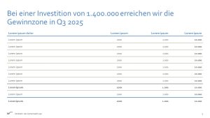
Finances
Now present the key financial figures such as sales forecasts and break-even analysis. Present the investment requirements and the use of capital transparently. Perhaps you can already report initial successes. Does your idea already have followers on social media or have test users already registered?
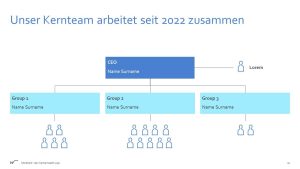
Team presentation
Introduce yourself, your founding team and important key people. Highlight your experience and expertise and convincingly convey that you and your team believe in the idea. This is about building trust and being convincing as a person or team.
The final slide
The last slide is memorable, so use it for a strong conclusion. Summarize your most important points. Show your roadmap with the next steps. Refer to the problem described at the beginning and end with the vision of a simpler/better world. And don’t forget the call-to-action – the request to the audience to support your idea. You can read more tips for the closing slide here: Achieving full impact with the PowerPoint closing slide
How do you work systematically with pitch decks?
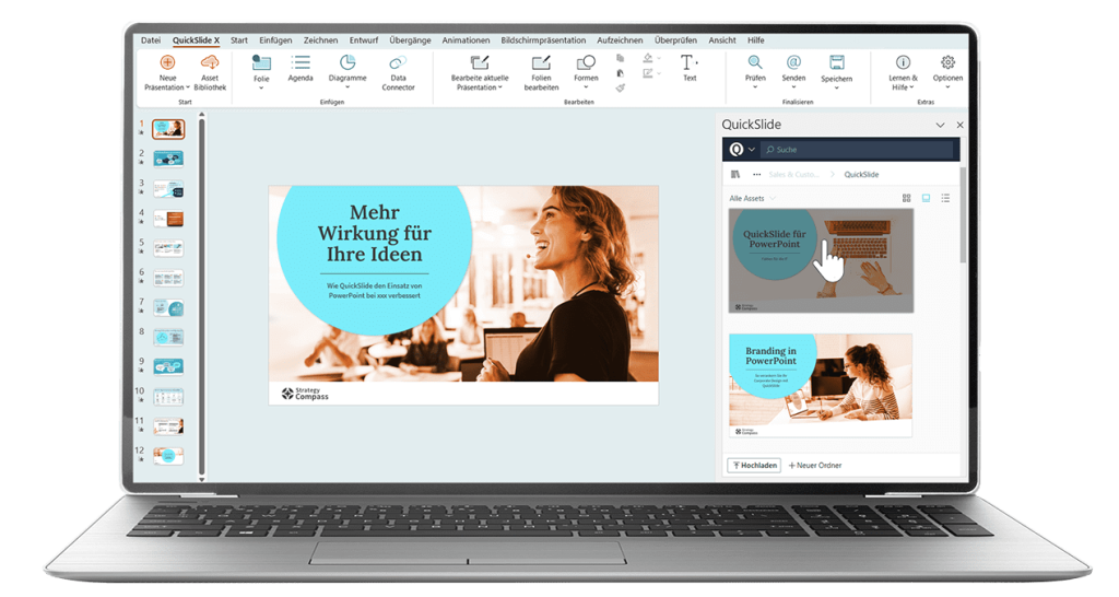
Anyone who is in the start-up phase of a company knows that it is not easy to find investors and supporters. A pitch deck is usually not enough. The slides should be adapted depending on the audience and the presentation situation. The order of the slides can change, as can the level of detail or the tone. If you have already created a pitch deck, this is a good basis. You can work with the existing slides in a modular way. It can be helpful to build up your own slide construction kit or slide library. You can manage all slides and presentations in one place, keep an overview and create new pitch decks from individual slides click by click. This saves a lot of time when preparing for appointments.
You can read more about this in our blog article Slide libraries for efficient work with PowerPoint
If you want to take a professional approach to pitch decks and slide management, we recommend using a PowerPoint add-in such as QuickSlide. In addition to slide and template management, QuickSlide offers a wide range of functions for creating brand-compliant presentations and editing slides efficiently.
Get in touch with us. We will be happy to advise you.