Formatting presentations
Your way to uniformly designed slides

Presentations are used to convey information effectively and convince the audience. A decisive factor for the success of a presentation is clarity. This also includes a clear visual appearance and therefore the correct and consistent formatting of the slides. After all, jumping headlines, changing font sizes and inconsistent colors distract from your content. Read this blog article to find out why a consistent design of your slides is so important and what you should bear in mind when formatting presentations.
Why is a consistent slide design crucial?
Tips for consistent formatting of slides and presentations
Work consistently right from the start
Why is a consistent slide design crucial?
Formatting presentations can be tedious. The effort involved is often underestimated and there is often not enough time for final adjustments, especially before important presentations. Even in a business environment, you often come across presentations that lack visual polish, that look messy, thrown together and therefore unprofessional.
Now you might think that content is more important than form and that, in case of doubt, it is better to invest your resources in preparing the content. This is a fallacy. Because content and form are closely linked:
- A consistent and professional design signals competence and credibility. The importance of the content is emphasized. An inconsistent presentation, on the other hand, gives the impression that the presenter is not well prepared and that the content has not been well researched.
- Clear and appealing slides promote comprehensibility and help the audience to concentrate on the content. An inconsistent design is distracting. The audience has to reorient themselves on each slide and become inattentive.
- A good slide design creates a clear visual hierarchy. Important information can be highlighted, while less relevant details fade into the background. With inconsistent presentations, this organizing principle is lost and the audience is quickly overwhelmed when classifying the content.
Tips for consistent formatting
Formatting presentations and working consistently right from the start

Consistent formatting is by no means the last step in a presentation. On the contrary. Deciding which layout to use and which design principles to apply should be at the very beginning of the work process. Good PowerPoint masters are usually available in companies – important tools for everyone who creates presentations. If you are working in a team, you should agree on important design issues at the first kick-off meeting:
- Which PowerPoint master are you working in?
In large corporations, there are often different masters for individual divisions. For customer presentations, the customer’s corporate design often also plays a role.
- Which design elements do you want to use and how do you deal with them?
Agree on the use of fonts and colors if this is not regulated by the PowerPoint master. For example, determine a signal color that you will use to highlight important information. What rules also apply to images and icons? Do you use an image database? Do you have a central image idea?
- What standards apply to the slide structure?
Define a maximum amount of text, decide on the use of continuous text, bullet points or action titles. - How is the agenda structured?
Will there be chapter slides? How do you deal with page numbers?
When collaborating on presentations, it is not only important to have a common understanding of the content of the presentation, the visual appearance should also be defined from the outset. This will save you time-consuming adjustments and revisions shortly before the presentation date.
You can also read our other blog articles on these topics:
Select font and font size

The font is an important design element in presentations. Make sure that you choose easy-to-read fonts that match the presentation topic. Sans serif fonts create a smooth, clear typeface with a modern character. Serif fonts look classically elegant and are well suited to formal presentations. Do not combine more than two different fonts. The fonts should be well differentiated, but also blend together to create a harmonious overall look. For example, you can use fonts with different weights from the same font family. Assign tasks to the fonts: Headline font, body text font. Stick strictly to this principle and do not mix them.
The presentation situation plays a role in the choice of font size. For presentations in front of a large audience, legibility must also be guaranteed for the audience in the last row. For online presentations, you can choose smaller font sizes and the font color should also be uniform. Pay attention to legibility here. A good contrast between the font and the background is important. Be careful with fonts that appear on images. Make sure that the font stands out well.
Important: Don’t reinvent the world. Use the fonts defined in your company’s corporate design and use your company’s PowerPoint master.
Use colors wisely
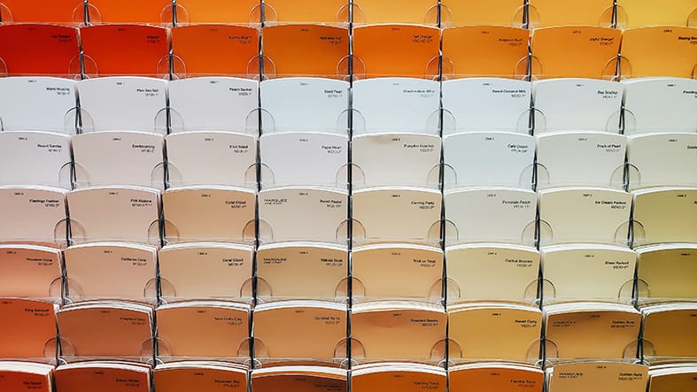
Colors are defined by your company’s corporate design. As a rule, a harmonious color palette is available with primary and secondary colors, which should also be used in this hierarchy.
Make sure that you stay within the defined “color world”. To make information easier to understand, it can also be helpful to use signal colors. In tables and diagrams, for example, these can be traffic light colors or colors that are suitable for country identifiers. Please use such colors with caution and only where they are useful for understanding. Under no circumstances should these colors replace or overlay the brand colors. It is important that you observe the general interpretation of colors, e.g. red is an “alarm color” and stands for negative results. In the case of competitive information, the logo colors of the companies are often used to make it easier to compare information.
A consistent slide structure: uniform, but not monotonous
A presentation in which every slide looks different is chaotic. A presentation in which every slide looks the same is boring. It is important to find a healthy degree of consistency and variety. The structure of slides is not only subject to design aspects, but above all to content. Depending on the type of information, different slide types are required.
Examples of slide types are
- Structural slides such as title slides, chapter overviews, concluding slides
- Argumentative slides, e.g. pros & cons, checklists, conclusion slides
- Diagram slides, e.g. column and bar charts, pie charts, waterfall charts, etc.
- Slides with infographics for quickly grasping facts and figures
- Process slides with processes, timelines and cycles
- Slides for organizational charts and structures
- Slides with maps
And many other presentation formats. You can read more about this in our blog article PowerPoint templates you need
This results in different slide layouts depending on the content. The dramaturgy of a presentation results from the alternation of visually and content-wise differently structured slides.
However, some basic principles in the structure should be uniform, including
- Alignment of elements to a defined grid: same spacing, same position of headings, text boxes, images, etc.
- Consistent use of bullet points
- Uniform positioning and consistent use of page numbers
- Uniform header and/or footer with the most important information (e.g. title of the presentation, date and company logo)
- Definition of free spaces and a maximum text length to avoid overloading the slides
Your own "language" for images, graphics and design elements
Use high-quality images and graphics that meaningfully complement or visually support the content. Pay attention to a consistent style. A “visual language” is usually defined in a company’s corporate design. Many companies have their own image databases. The image material that is made available corresponds to the brand claim. If you are looking for suitable images yourself, you should make sure you use a consistent style. Do you use symbolic images or “snapshots”, do you use illustrations or lifestyle images? Whatever you decide, try to stick to this style and not mix different imagery. This very quickly leads to a random and inconsistent visual appearance.
Image databases often offer image series with different motifs in one visual language. But be careful with all images from image database that you want to use for your presentation. Pay attention to the image rights and licenses. Of course, this also applies to images from other sources that have not been officially released for use.
You can read more on this topic here: Image rights in presentations can be a pitfall
Allow time for the final check
Even if you follow our first tip and work in the right master right from the start, you should allow time for the final check of your presentation. This is because errors can easily creep in during editing. Be sure to check your presentation in presentation mode, as you will quickly notice any slipped headlines and elements. You will also need time for proofreading. Our tip: have someone look over the presentation who has not worked on it. This is because the proverbial operational blindness makes it difficult for you to detect errors and inaccuracies.
If you use a PowerPoint add-in such as QuickSlide in your company, you have a clear advantage. QuickSlide checks your presentation for the correct use of corporate design and corporate wording. Deviations are displayed and can be corrected with a single click.
Formatting presentations - a conclusion
The correct formatting of presentations is crucial in order to convey content effectively and convince the audience. Consistent design helps to exude professionalism, promote comprehensibility and capture the audience’s attention.
We would be happy to explain how you can use QuickSlide to help your employees create consistent and brand-compliant presentations. Get in touch with us.