Strategy Compass Logo AddIns for Microsoft Office
Search
Close this search box.
Board meetings and presentations_

Effective board meetings with pertinent presentations

Effective board meetings with pertinent presentations

Reading time 4 minutes
Good meetings require good preparation. Particularly board meetings, where participants’ time is in short supply, not to mention expensive. Our two examples show how long-established processes can sometimes hinder efficiency and effectiveness, rather than ensuring it.

Example 1:

A large automotive supplier:
Weekly board meetings on Mondays.

A large automotive supplier, with weekly board meetings on Mondays. Procedure: Participating managers must submit presentations on their respective agenda topics by Friday lunchtime and present them personally, unchanged, on Monday. This means board members have around 300 slides to read each weekend, ranging from detailed spreadsheets and solid text to strikingly presented ideas. Some targeted and well-thought-out, some completely unclear. Nearly all are in the corporate design, but with different, totally individual interpretations. When board members are through reading, they have more questions than answers. Hardly surprising that over the years, they have come to dread the thick folder of weekend reading, not least as they have to sit through the whole thing again on Monday.
board meetings and presentations_

Example 2:

A bank.
Procedure: Board submissions are prepared one week before the meeting in Word.

The Word document is always structured the same way, with the problem, suggested solution and decision required. All documents are read before the meeting, where a summary is given in person before the topics are discussed. So far, so good, but here too, a growing problem has emerged. Consistency between submissions has been increasingly overlooked. 20 major business areas with as many different formats, sometimes on three pages, sometimes 30. The heart of the problem is often masked by detail, and solutions are suggested without mentioning alternatives. Extremely varied approaches and thought processes often fail to produce a document that adequately supports decision-making.

All the presenters are certainly doing their best – not just because they’re presenting to the board of directors, but because they want to achieve their goals. However, the documents and the way they’re presented often fail to provide the rapid, well-balanced information that the board needs.

The result: discussions provide no clear outcome and key decisions get postponed.

decisions in meetings

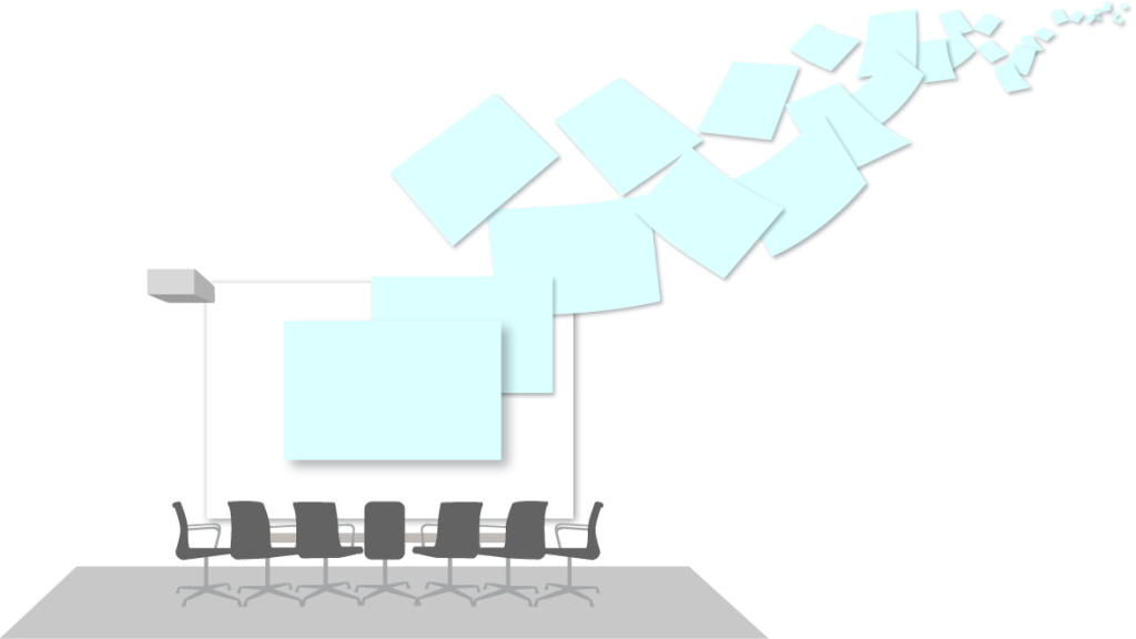
The rocky road to board presentations

When we work with clients on this problem, a closer look usually reveals a multilevel problem:

  • The board is not happy with the quality of the submitted/presented documents.
  • The presenters (usually top and mid-level management) are unsure how to structure their submissions. What does the board expect? What to include, what to leave out?
  • These presenters are also on the receiving end of documents, such as slides supplied by their departments, typically of varying quality.
  • And their staff are also not really sure what their boss, or boss’s boss, or the board itself, really wants.
The production of each document therefore involves a whole bunch of people having to cope with numerous uncertainties and possible interpretations, and this is the nub of the matter.
Board meetings preperation

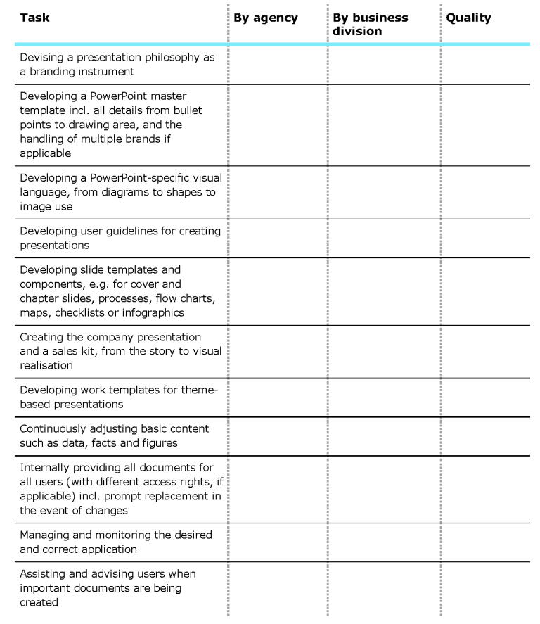
Prestructured board submission templates provide clarity

The solution lies in clear guidelines and a clearly specified structure. Apart from having a general schema, it’s often worth providing specific templates for frequently recurring topics, for instance:

  • Status reports for regions, major projects, programs
  • Strategies for business units, departments
  • Decisions about new sites, investments
  • Development of sales figures, KPIs
  • Analyses of trends, markets, technologies

Based on a fundamental structure – for instance, pyramidal – the topics, their structure and the kind of information expected in each section are laid down in advance. This requires intensive preliminary thought but it brings noticeable long-term savings in time and effort. The process itself also provides orientation for a whole organization regarding the board’s focus and how it thinks.

How to run a project to produce well-thought-out board presentations

One tried-and-true procedure follows these steps:

  1. Set up an initial moderated workshop with the board or individual board members
  2. Produce of a consensus on wishes and expectations
  3. Review typical submissions to develop a basic schema
  4. Apply particular examples on selected topics, to test the specifications
  5. Create a generic template and a best practice example per topic
  6. Hold a workshop with top-level management and/or frequent presenters for training, discussion and fine-tuning
  7. If adequate, introduce supporting software tools that intelligently manage templates and ensure they are up to date
Workshop Icon

Experience has shown that this process becomes self-sustaining very quickly. Targets and expectations become clear, templates are available, and the reasoning behind it all is understood. Once it’s established in one area or with one topic, then transferring the process to another area or topic is easy. 

We can support you on projects just like this – just get in touch with us for a non-binding chat to discuss your concerns.

Responsible for corporate design

Implementing a new corporate design at Strategy Compass

Implementing a new corporate design at Strategy Compass

What it’s like to be your own client

Reading time 6 minutes
Corporate Communication Strategy Compass

One aspect of our daily business is advising our customers, on the rollout of a new corporate design across all business communications. We help diverse organizations structure this process, with all the different steps and touchpoints involved, and with the sustainable migration of their new brand identity using QuickTools.

But then we had a slightly different client – us! We developed our new corporate design at the end of 2021. We sharpened our company’s positioning and redefined our brand visuals and language. Many of our customers hire external agencies for this, but we implemented the project with our in-house resources and expertise.

Then we faced the same question that many Strategy Compass clients have when they turn to us for help: How can we most efficiently roll out our new corporate design across the whole company and all communication channels?

It was time to follow our own advice, and the steps we usually lay out for our customers.

One person in charge

Sounds a bit trite, but it’s not. The integration of a new corporate design into PowerPoint and Word is perhaps seen as something that’s taken on by everyone as they go along and create each new content asset. This won’t work, though, especially for large organizations or medium-sized businesses like ours. Someone needs to be responsible for the entire process. Precise decisions need to be made, for instance, should system fonts or corporate fonts be used? So, we too designated a central person to keep an eye on all aspects of the new CI and drive us all forward: Marion, our Design Lead in the Marketing team. Our customers also typically choose someone from their marketing or communications divisions to manage this process, with our support. For more on this, see our post Who’s responsible for presentations?
Responsible for corporate design

Corporate design in MS Office

So, we established our new design – and this is when the real work began. The visual language and specifications we’d integrated into our new-look Strategy Compass website now had to be translated to other channels and formats, in particular Microsoft Office.

We needed to ask ourselves fundamental questions, including:

  • How do we transfer our brand assets to Office?
  • How much creative freedom do we allow? Where must we make restrictions?
  • Which documents should we create and for which scenarios, for instance, PowerPoint for in-person versus remote presentations?
  • Should we plan the migration around a fixed date, or should we aim for a seamless transition?

Answering these and other questions helped us form the basis for the next steps.

Entscheidungen beim Corporate Design Relaunch Piktogramm

Collaboration for establishing frameworks and guidelines

Now it was time for action. The first step was to develop our PowerPoint master and Word templates – documents all employees would use as a basis for their work. Besides aiming for our usual high-quality standard, we needed these documents to be user-friendly. And, just like our customers, we needed input and support. As our colleagues would be the ones using the documents, it was crucial that they were happy with and could work with them. A one-size-fits-all approach never works, for instance, sales personnel have different needs to marketing, management require a different framework to the support team. So, we involved representatives from each of our internal user groups in the development process. We needed a collaborative approach to make sure everyone’s needs were met for greatest, long-term efficiency. We recommend this approach to every customer we work with.

The completed master documents are the foundation for our QuickTools. These are stored within our products and ensure that our corporate design is preset for using PowerPoint, Word and Outlook. In addition, the automatic adaption of older versions of slides and presentations to the latest, corporate-design compliant version is possible with a dedicated conversion tool.

Besides our masters and templates, we developed a Strategy Compass brand book. While master assets have our new design embedded within them, this style guide provides a clear outline of the corporate design so that all users have a good feel for the new brand identity in Microsoft Office. It includes practical instructions on how to use the corporate design, typical pitfalls, dos and don’ts, and tips for image selection. This document is also stored in QuickSlide and is accessible to every employee for reference.

Brand Book

Slide and document pool in QuickSlide

Then we really got down to business. Like most companies, we’d accumulated a wealth of documents, slides and presentations over the past few years. The introduction of our new corporate design provided an ideal chance to sort out which of those we really needed, tidy up our files and put all our new elements to the test.

Our key goals were to simplify document creation through an intelligent modular system and offer even better support for users in preliminary conceptual work. We wanted to clarify the document creation process and establish a better basis for results by asking key questions around the purpose, objectives, target groups and scenarios for creating the documents in the first place. And we needed to take action, so we

  • reviewed and clustered all existing documents, slides and presentations.
  • compared the existing material with user requirements.
  • revised or supplemented templates or deleted superfluous ones.
  • drafted a modular system for creating documents and presentations.
  • developed conceptual support for document creation.
Ordnerstruktur in QuickSlide

A rapid rollout with QuickTools

So, the implementation could begin. Despite deciding on a gradual, smooth transition to our new corporate design, for our Microsoft Office assets we wanted this stage to be quick and painless. Our own tools eased the process for us, just as they help all our customers. 

We used QuickSlide to make all our slides and presentations available for colleagues to access and maintain in one central place. The new PowerPoint master is stored in QuickSlide. The new slide templates are in the QuickSlide Slide Pool. Everyone could create documents in the new corporate design immediately. All our older presentations were rapidly transformed into the new corporate design. The Corporate Design Check reliably alerted us to any deviations in style and corrected slides as needed.

We use QuickDoc to provide all our colleagues with an intelligent system that significantly reduces the number of Word templates. It dynamically fills in documents with the correct elements, such as business data, recipient addresses and signatures. Text modules are quickly transformed into high-quality, brand-compliant documents.

QuickMail ensures every employee uses our new logo and correct signature format in Outlook. All it took was just one central change in the system for all updates to be made available to everyone immediately.

Permissions management

We set up a rights management system in QuickTools to clearly define who would have access to which assets and who can make changes to templates, slides and documents. This creates a clearer overview and a streamlined file-creation process for every user, as they can only view or update the items they really need to carry out their work.

Developing a governance framework

This is how we efficiently rolled out the new Strategy Compass corporate design – but our story doesn’t stop there.

We’ve defined several objectives which we’ll review in the coming months. We outlined parameters for measuring our success at certain intervals and to identify areas where we might still need to optimize our setup and processes. For instance, we’ll track which slides are used regularly and which are not, so we can improve these templates as needed.

Objectives

Over to you

We’ve worked through these steps in the past few weeks where we normally support you, our customers – and it proved to us once again that the whole process we frequently recommend works very well!

What about you? Are you planning a corporate design relaunch for your organization?

If so, and you’d like to find out more about the process, just get in touch with us. We’d be happy to advise and support you.

Creating Charts QuickSlide Strategy Compass

New functions for creating charts with QuickSlide

New functions for creating charts with QuickSlide

Reading time 2 minutes

Interview with Achim Sztuka, co-founder and CEO of Strategy Compass

Achim Sztuka CEO Strategy Compass

Hi Achim, is there anything new to report on QuickSlide?

Achim: Yes, we spent several weeks working at full speed on a new release. And the result speaks for itself. We now offer our customers even more ways to save time and money when using PowerPoint professionally.


What is so special about the new QuickSlide?

Achim: We concentrated intensively on data visualization. Creating professional reports has long been a focus of ours. Until now, many of our customers were using other add-ins to efficiently generate the necessary visuals. They’d repeatedly ask us to expand QuickSlide into this area so they could reduce their number of add-ins. And that’s exactly what we’ve now done.


How has QuickSlide changed?

Achim: We’ve expanded and improved the functions for editing SmartCharts – growth rates, deltas, axis breaks etc. – and waterfall charts. The user experience is now in general much smoother, plus, we’ve further developed the performance of the Data Connector. It connects Excel with PowerPoint so that data-driven reports can be fully automated, even with large volumes of data.

What about connecting other systems?

Achim: We’ve worked on this too. The QuickSlide Media Connector links media databases directly to PowerPoint. We’ve now used it to connect various other DAM systems, and of course also expanded the available options. 


More functions and greater efficiency – is that a fair summary of the recent innovations?

Achim: Yes, but one other thing is particularly important: Last year, we ran workshops with chart power users at several of our major customers. At these workshops, we openly evaluated where we still had gaps that were preventing power users from doing away with other add-ins, like think-cell®. The new release has let us close these gaps. For many customers, this is a key step in simplifying their IT landscape. 


Will there be additional developments in future?

Achim: We’re constantly developing our products, and of course already have our next goals in the pipeline. For instance, we’re about to launch QuickMail to centrally manage email signatures. We also have quite a few things planned for content management. 


Thank you, Achim, for the chat, and all the best with the new QuickSlide functions.

The new QuickSlide functions at a glance.

Data visualization

The step-by-step approach to data visualization in presentations

The step-by-step approach to data visualization in presentations

Reading time 5 minutes

We live in an age of digital information flow. Credibility and verifiability are important currencies when it comes to conveying information. While facts and figures have gained new significance, they often struggle to get noticed alongside the much better performing visual content.

Data visualization is the art of converting contexts, circumstances, and developments derived from verifiable data into visual objects in such a way that they are, ideally, graspable and comprehensible right from the first glance. Infographics, pie charts, bar graphs, or radar charts are all popular formats.

Column-chart
Pie-chart
Net-diagram

But how can larger volumes of data also be used to paint an informative picture? In five steps, we’ll explain what you need to remember when creating charts, diagrams, and graphs.

Step 1:

The data assessment

Companies generally have access to a wide range of data. Be selective when choosing the data you want to communicate. Assess the informative value and knowledge gain offered by the data sets. When it comes to graphs, charts and diagrams, the same approach applies as for all other PowerPoint-presentation content: Keep your presentation as short and concise as possible, and avoid overloading it with superfluous information.

Data is relevant if, for example:

  • It shows developments that enable forecasts to be made for the future.
  • It describes pattern deviations that indicate changes in trends.
  • It highlights contexts/correlations previously unheard of.
  • It confirms previously unverifiable assumptions. 

Our tip: If you’re not sure whether certain data is important for your presentation, put it on a backup slide or in the appendix. If a relevant discussion or question comes up during your presentation, you can instantly access it then. This will show you’re well prepared and have thought your presentation through very carefully. And can focus on what’s most important for your audience.

Daten filtern

Step 2:

The message

Data is often multidimensional, which makes it complex and difficult to understand. When it comes to data visualization, it is important to concentrate on the main findings and make clear, simple statements. But this also means you need to leave out anything that’s unnecessary. Excessive detail does not make a chart better. A core statement is not made more concise by having extra aspects added on to it. When handling data, people often fall into the trap of following an almost scientific approach. But most business presentations are not of a scientific nature; they’re about key findings. And the more scaled back these are, the clearer they become.

Our tip: Do you feel like you lose too much information by reducing data to a single message? Then check whether you can address the individual aspects separately. Make the most of visual storytelling, and combine various data representations into a well-structured narrative.

Daten untersuchen

Step 3:

The target audience

Carefully consider the target audience of your presentation, and think about how familiar they are with handling data. While data is seen as proof of certain statements, it often also raises new questions. Always state the data source, and be prepared for questions about the collection method, time frame, and contexts/correlations.

Try not to overwhelm your target audience. Remember, even though you’ve been working with the tables and charts for a long time, this is the first time your audience will be seeing them.

Our tip: Remember the 15-second rule for presenting data. Anything that doesn’t trigger a “lightbulb moment” among your target audience within this time frame is definitely too complex. Test it on your coworkers and scale back your information if necessary.

Zielgruppe

Step 4:

Navigation

When visualizing your data, only apply principles that will help your audience navigate and grasp the message. Making a table colorful because it looks nicer is not constructive; it might even end up being confusing. The human brain takes in lots of information subconsciously and sorts it. And there are certain perception principles you can utilize. Give your audience whatever they need to understand and easily grasp what you are showing, such as:

  • A clear verbal introduction
  • A clear heading conveying the slide’s core statement
  • Colors of emotional significance (red=danger, yellow=neutral, green=desirable, corporate colors and competitor colors)
  • Logical reading order (left to right and clockwise, e.g. based on importance and percentage in a pie chart)
  • Labelling and accompanying texts reduced to the absolutely necessary, avoid repetition
  • Learned symbols, e.g. symbols for female and male or flags
  • Important information highlighted—using size, color, or distinguishing elements
Strategy Compass_Favicon_white

Step 5:

Implementation

Only once you are familiar with your data and have identified the main statement can you determine the type of data suitable. It’s not just the visual attractiveness of a display format that is crucial; its function is too. Situations can be shown differently to processes. Contexts/correlations require a different format to percentages. A list of the most common display formats and their areas of use is available here.

When visualizing your data, be sure to take into account your company’s corporate design. PowerPoint masters are unfortunately often patchy when it comes to data visualization. This is a shame, because uniformly designed tables and charts convey a sense of professionalism, and underline the credibility of the information. Data visualizations are a key part of branding.

Contact us if you want to know how to professionally create data in your corporate design in PowerPoint.

More info:

Also remember our 5 criteria for successful PowerPoint presentations, and follow the OSCAR principle, which can also be applied to data visualization.

Office space with table and chairs

External agencies and PowerPoint: How’s it going?

External agencies and PowerPoint: how's it going?

Reading time 2 minutes

Let’s face it, communication, marketing or advertising agencies don’t exactly get excited about PowerPoint masters or slide templates. The focus, after all, is on completely different, more thrilling issues such as communication concepts, brand, cross-channel marketing, websites and campaigns. Maybe the agency your company works with just sees PowerPoint presentations as a sideline act. Perhaps slides are only really looked at whenever your corporate design is being developed or relaunched, and a master template and some standard slides are created. Maybe PowerPoint is seen as dull or tedious. Organizing how presentations are handled between organizations and agencies is often an operational matter involving diverse factors, and many individual users. 

Get a brief overview of your current situation by rating the following aspects for labor division and quality: 

Checklist Agentur

How much time and effort do you spend on briefing rounds, processes and organization as everyday collaboration with your agency? 

How much expertise does your agency have when it comes to PowerPoint software? How do you cope with practical problems such as external colleagues with no or very little graphic design knowledge or the specific requirements for internal and external presentations? What are your technical and organizational processes for creating and giving presentations? 

Define your expectations of the agency you work with. Get them to explain and prove their expertise. Check that your expectations are feasible and realistic. 

Work with your agency to establish a sensible and feasible degree of outsourcing. Define time-savers, interfaces, tasks and everyday processes. Identify the time and expense left over. Identify the agency costs and offset them against your own expenses. 

We’re keen to know what you discover during this exercise. We’d love to show you new ways of getting more out of it and saving on costs. Get in touch. 

Notebook

How many Microsoft Office add-ins does a company need?

How many Microsoft Office add-ins does a company need?

Reading time 2 minutes

... and how can you save on licensing costs?

The Microsoft add-ins landscape can vary greatly between companies. While there are always areas where certain programs are essential for highly specialized usage requirements, there’s still some overlap between applications. And this means potential for saving.

Lots doesn’t always mean more

PowerPoint Add-in

When we talk with companies, we often find they use different tools for the same applications. In many cases, the reason is historical – the company has always done it this way. Specialized add-ins, for chart editing, for example, are then added to a broad-based add-in like QuickSlide for PowerPoint. It’s worth taking a closer look at specialized programs, as they’re generally very cost intensive.

Easily replacing add-ins

Some of the specialized and cost-intensive add-ins were often purchased earlier on, and their added value needs to be regularly reviewed. Because add-ins with a broad range of functions, such as the QuickSlide PowerPoint add-in, are constantly being developed further, they increasingly cover the needs of specialized applications. QuickSlide, for example, has expanded and optimized its functions for creating and editing charts in such a way that it can now easily replace specific chart-editing programs like think-cell®.

Saving on licensing costs

Additional add-ins can either be replaced either completely, or at least for users who don’t need in-depth access to functions. Which is generally most users. Specialized programs are aimed at heavy users from specific divisions. “Normal” Microsoft Office users are not their focus; they can find everything they need in the basic add-in they work with daily. This means duplicate licenses can be spared, which significantly reduces costs.

A practical example: 90% superfluous.

Experience from projects revolving around replacing conventional, costly chart-editing program, think-cell®, has shown us that 10% of all think-cell® licenses have been left unused for long periods of time, and a further 80% of licenses could be converted to QuickSlide without any loss of performance or convenience. Only 10% of users from specialized divisions and user groups can’t do away with using the program. Learn more.

90Prozent Kosten sparen

Our consulting service for replacing add-ins

Think your company could save on licensing costs by replacing certain add-ins? If so, get in touch with us. We’ll help you identify the replaceable licenses and systematically leverage your savings potential. Contact us.

think-cell® is a registered trademark of think-cell Software GmbH
Training in the company

Presentation management for training divisions

Organizing training materials in PowerPoint

Presentation management for training divisions

Reading time 5 minutes
Training in the company

Seminars, training courses, staff development programs and company academies are important factors that contribute to the success of companies – at various levels simultaneously. Internally through staff qualification, recruitment and motivation. Externally through customer loyalty and improved sales. Many divisions and departments are involved. From sales and HR to IT, sometimes even a company academy with freelance or permanently employed trainers. The topics are as varied as the participants. And the contents are as varied as the topics. Often involving thousands of slides for ump-teen modules, training topics and courses. Perhaps encompassing both eLearning and classroom sessions. For sure with a whole bunch of overlaps, where identical slides are used in different modules. And depending on the size of the company, with everything in two or more languages.

Ensuring consistent, permanently updated content is an organizational challenge. Or even just knowing that a slide already exists, and doesn’t have to be newly created by each person involved. And the situation gets really critical as soon as changes in format, design or company structure are introduced. In times of digitalization, the magic word is automation. With a few small and intelligent adjustments, you can enter this new era at any time.

Three steps to efficient slide management for training divisions

You only need to make adjustments in three key areas to make life so much easier for everyone involved, from organization to application. Benefits include time-saving, increased efficiency, greater security and fewer errors.

1.

The organizational adjustment

Organisation Icon
Make someone centrally responsible for everything concerning PowerPoint in your company. They hold all the threads in their hands: feedback from the field, and from liaising with marketing, brand management, IT and any third parties or external service providers involved. This gives one central contact person an overview of everything that’s going well – or not so well. Someone who can channel people’s wishes and needs and initiate rapid and targeted solutions by networking with the departments involved. It also allows better management of internal or external service providers to ensure optimal quality and keep an overview of costs. It simplifies things and eases the burden, steering clear of patchwork, go-it-alone or piecemeal solutions. Don’t worry: once the issue has been properly addressed, the task won’t eat away at your schedule . Generally, division assistants or PAs are a good choice. It should ideally be someone who’s familiar with PowerPoint, who is well networked within the company, and is in close contact with management. Please note: this person is not there to prepare your presentations for you. They’re there to smooth the ground, making your work with presentations easier.

2.

The IT and software tool adjustment

IT Werkzeuge Icon

Step 2.1

Define the requirements for automating your slide management. Preferably at a round table in a moderated workshop. Identify in advance all the training modules, topics, courses and the approximate number of slides currently in use, together with the methods of production, the people involved, their roles and points of interaction. Get yourself a detailed picture of your current processes.

With this overview, you can quickly identify your bottlenecks. This gives you a clear profile for software support. Things to consider include:

  • A data repository for all slides
  • Eliminating the “reinventing the wheel” trap, by eliminating sources of error, such as email distribution, sharing central folders, intranet, wikis, etc.
  • The possibility of maintaining and updating all copies of frequently used slides at one central location, also for slide deletion
  • Security through allocation of responsibilities and access
  • Convenient provision of the complete stock of up-to-date presentations and slides when PowerPoint is opened
  • Easy access and precise search function
  • Keywording, with the possibility of centrally defined categories, as required
  • Simplification of slide production, for instance through automation of any necessary translation processes, links to image databases, including icons and illustrations, etc.

Step 2.2

Hold a meeting to clarify the environment and the software support with your IT department. Prepare a document with your requirements to give IT some rapid orientation. Find out in advance which tools could be useful to you, and the kind of presentation management you’d like to have, so that the meeting has a positive outcome. IT needs to quickly understand your requirements, challenges, goals and benefits, so smooth the path for them in a service-oriented way. From now on it becomes a little project, at the end of which all involved parties will be able to handle PowerPoint, and every kind of presentation, much more easily.

3.

The content preparation and implementation adjustment

Workshop Icon

Training divisions, academies and institutes typically have a sheer unmanageable number of slides, modules and presentations. Once you’ve found the software for automating your slide management, first transfer everything you have into the underlying slide pool. Use a well-structured, methodical system, to subsequently exploit its full potential.

Now the newly defined workflow comes into action. Every slide that’s edited, deleted or newly created is correctly linked and keyworded, and integrated into the specified automation process. Gradually achieving your desired degree of perfection.

You can decide to do all of this straight away, or allow a gradual transition. Both possibilities give you advantages from the word go. The decision depends on your available resources and how you view investment and ROI.

In conclusion

A bit of effort, some analysis, a few organizational tweaks and a little project with marketing and IT are all that’s required to send you on your way to a digitalized presentation future. Under the heading “modular training kit,” and with a significant degree of automation, you enable your training division to produce PowerPoint presentations much faster and more easily. And make them clearer and more appealing in the process. Plus, always accurate and up to date. You should plan a three-month project timeline. This will equip your training colleagues with a future-proof system. Time invested in this project though is nothing compared to what they would otherwise have to spend on admin instead of being “out there” delivering training sessions.

Modular training kit

Modular training kits in PowerPoint are part of the “organization” aspect. They are a key focus of the presentation management component of the PowerPoint add-in, QuickSlide. Intelligent integration into the existing IT environment allows presentation activities to be controlled and automated from a central administration, whether in a HR training division, departmental training units, company academies or further education institutes, or even in global group structures. This is a significant element in optimizing input and benefits, thereby enabling staff to concentrate on its core competencies

Baukasten Icon
Sales employees with tablet

Sales and PowerPoint

Sales and PowerPoint

Presentation management as the basis for efficiency and success

Reading time 7 minutes
Sales employees with tablet

Customer. Sales targets. Brand. Resources.

The customer is important. His world, his reasoning, his goals and expectations.

Sales targets are important. Persuasion, differentiation, agreements, turnover and margins.

The brand is important. Performance, look and feel, marketing strategy and requirements.

Resources are important. How often do you hear: “You’ve got to get out there more!”?

And then there’s PowerPoint. In most cases the medium of choice in customer meetings where the Sales department wants to acquire or convince customers, inform them about projects or present a new product. Our international survey revealed that over two-thirds of external meetings featured a PowerPoint presentation. Understandably, as the visual reinforcement strengthens the speaker’s own message, and helps them compose and structure the presentation. This is where the balancing act with targets and resources comes in. Because every presentation is either freshly created, or specially adapted for a particular meeting, target audience or subject area. Most companies provide a prepared company presentation, templates or individual subject slides. The division, department, or the sales executives themselves, take care of the rest. With varying degrees of effort, frustration and up-to-date content.

Well-thought-out presentation management encourages sales approaches that, together with new solutions, can save a great deal of effort. Allowing more time to be spent “out there” with the customer.

Vertriebsziele Illustration

Three tweaks to achieve efficiency in sales presentations

Every company, every sales division need only make adjustments in three
key areas in order to turn a tedious but necessary procedure into a loved and successful one.

1. Organization
2. Content planning
3. IT and software tools 

These tweaks are also pretty easy to make. A bit of analysis, reflection and planning in advance, and dealing with presentations in your company becomes easier than you dared hope. With many benefits that go way beyond the merely quantitative. Let’s take a closer look, and develop a practical course of action.

1.

The organizational adjustment

Organisation Icon

Make someone centrally responsible for everything concerning PowerPoint in your company. They hold all the threads in their hands: feedback from the field, and from liaising with marketing, brand management, IT and any third parties or external service providers involved. This gives one central contact person an overview of everything that’s going well – or not so well. Someone who can channel people’s wishes and needs, and initiate rapid and targeted solutions by networking with the departments involved. It also allows better management of internal or external service providers to ensure optimal quality and keep an overview of costs. It simplifies things and eases the burden, steering clear of patchwork, go-it-alone or piecemeal solutions.

Don’t worry, once the issue has been properly addressed, the job won’t blow a hole in your regular schedule. Generally, division assistants or PAs are a good choice. It should definitely be someone who is familiar with PowerPoint, who is well networked within the company, and is in close contact with management. Please note: this person is not there to prepare your presentations for you. They’re there to smooth the ground, making your work with presentations easier.

2.

The content planning adjustment

Baukasten Icon

Step 1

Analyze the main demand for sales presentations in your company. Make a list of regularly occurring presentation types, and the most time-consuming ones. For example:

  • A company presentation for a first pitch
  • A specialist introduction to your division
  • The presentation of products or services
  • Industry-specific solutions
  • Credentials and case studies
  • Recurring basic structures e.g. project
    status or reporting
  • Annual talks
  • Campaigns and promotions
  • Or…?

Step 2

Define your interfaces with marketing and discuss your requirements: your central presentation coordinator can now meet with your contact in marketing. Depending on how your company is organized, this could involve various offices or divisions, but the important thing is to avoid multiple discussions with different colleagues, which make it hard to get a full, clear picture of the situation. Go straight to the person with overall responsibility who is authorized to make decisions. State the challenges and your need for optimal input. Explain the implications and consequences regarding benefits, costs, and time. This is also in marketing’s interest. At the end of the day, your colleagues want you to be an enthusiastic ambassador for the brand, who upholds central directives and presents the relevant current versions and content to the outside world. You’re practically preaching to the choir.

Organisation von Präsentationen

Step 3

Subject to the role of your company marketing (depending on the company’s organization, this may be central marketing, divisional marketing or external service providers) define the basic requirements with which they can contribute to your sales success. On three levels:

Define how Marketing can contribute to your sales success.

Basic level

In most companies, central marketing provides at least a master (also known as a template). In order that you can really benefit from it, the intelligence with which the master has been programmed for PowerPoint is of crucial importance. So define the most important criteria for you as your basic requirements, and ascertain from your marketing contact whether the respective solutions are already available or need to be produced. An excellently programmed master that’s aligned with PowerPoint’s specific requirements should, among other things, contain detailed specifications for the color logic and the typography of each text level, should facilitate working with suitable layouts correctly aligned to the presentation grid, be compatible with other company masters, and be optimized for various types of use, including printing and handouts.

Slide level

Pre-prepared single slides with recurring content that can be used when putting together presentations can save you a lot of time. You should first check if these already exist, and if so, who’s responsible for them. This could be central or divisional marketing, other departments, or perhaps no one so far. Once you’ve clarified this, obtain these slides or outsource the task of creating them to an external service provider. We work with companies that provide thousands of pre-prepared slides, for instance, for products, specific topics, customer testimonials or case studies.

Presentation level

Completely pre-prepared presentations that just need minor adaptations for each meeting (customer logo, etc.), for example:

  • Pre-prepared company presentation for first contacts
  • A pre-prepared product presentation for each product/service
  • Pre-prepared industry presentations
  • Pre-prepared presentations for specific topics
  • Variations for different target groups

Together, the presentation level and the slide level form a modular “sales kit,” from which you can compile, pull out or directly use the exact material required with only a few mouse clicks.

Präsentationsebene Illustration

3.

The IT and software tool adjustment

Ensure with the support of a software tool that slides are updated or changed only once, by one person, in one place. And that regardless of how often the slides have been stored or used, these changes flow automatically into all versions at all locations.

Good software tools for efficient presentation management relieve users of the obligation to constantly check for updates (as is the case with central or distributed file shares with central or distributed folders, email distribution, internet, wiki software, etc.) and the inevitable versions chaos this causes. Users are automatically informed about changes and updates when they use a slide, and can integrate these with a single click.

This applies to changes in data, content and figures, such as number of employees, turnover, developments and histories, etc., as well as to design changes.

A prerequisite is to establish one central data pool where all content is deposited and maintained, accompanied by a proper process and including access and modification rights. An integration of your existing image databases or your MAM/DAM system can transfer this method of operation to all elements in use.

There will have to be a meeting to clarify the environment and software support with your IT department. Prepare a document with your requirements to give IT some rapid orientation. Find out in advance which tools could be useful to you and the kind of presentation management you’d like to have, so that the meeting has a positive outcome. IT must quickly understand your needs, challenges, goals and benefits, so you should smooth the path for them in a service-oriented way. From now on it becomes a little project, at the end of which marketing, together with your sales division, immerses themselves in the digital sphere, where everyone involved can handle PowerPoint and every kind of presentation with considerably more ease.

Relieve users of the obligation to constantly check for updates.

Präsentations-Management

In conclusion

A small amount of effort, some analysis, a few organizational tweaks and a little project with marketing and IT are all that’s required to send you on your way to a digitalized presentation future. Under the slogan “modular sales kit,” and with a significant degree of automation, you enable your sales division to produce PowerPoint presentations much faster and more easily. And make them more attractive and persuasive in the process. And most importantly: always accurate and up to date. Realistically, you should plan across three months for a focused project like this, to equip your sales team with a future-proof setup. But this is a drop in the ocean when you consider how much more time you can then spend “out there” – selling rather than administrating.

Modular sales kit

The success of sales presentations relies on good organization, competent application and perfect presentation.

Modular sales kits in PowerPoint are part of the “organization” aspect. They’re a key focus of the presentation management component of the QuickSlide for PowerPoint add-in. Intelligent integration into the existing IT environment allows presentation activities to be controlled and automated – across regional sales offices and global group structures alike. A significant element in balancing input and benefit, and enabling your sales staff to concentrate on its core competencies.

Baukasten Icon
Office space with table and chairs

Who´s responsible for presentations

Who's responsible for presentations?

Reading time 3 minutes

Clear responsibility for presentations is a factor in corporate success. At first, this may seem odd. Marketing provides the template and the company presentation, HR runs training courses in software and presentation techniques, IT ensures PowerPoint operates smoothly, and everyone else is responsible for creating the actual presentations. There’s simply no other way; after all, every presentation is unique, depending on objectives, audience and the person giving it.

who is responsible for presentations

Scratch the idea of individual presentations

Reset the way you think. All these individual aspects are based on a host of organizational factors that can’t be dealt with by one single department or user for the entire company. Nor would any single department or user probably want to do that. This requires interdisciplinary knowledge, a good network within the company, business acumen, and assertiveness – and most people lack the time, the will, or the capacity for these things.

Which individual aspects are needed for a holistic approach to presentations?

  • Finance: Reporting total costs, setting KPIs, assessing improvement measures
  • IT: Assessing the technology used and its embedding in the overall systems landscape, incorporation into digitalization efforts, architecture, and organization of data pools for presentations or images, process automation, improving user experience in the workplace
  • HR: Providing training courses, from software to argumentation and slide design to communication, presentation techniques and branding
  • Sales: Type of presentation, occasion, resource constraints, managing recurring components and elements, simplifying processes for creating and giving presentations
  • Marketing: Corporate identity, corporate design, corporate wording, the way brand messages and brand personality are conveyed by the presenter, consistent and up-to-date look, facts and figures
Requirements for presentations illustration

Now imagine which people need to talk and work together for this to work. Imagine the long-term benefits that these (ongoing) discussions could bring if your organization took a collaborative approach.

How to create a greater whole

Appoint someone with a strategic perspective for your organization, who is well networked, and who can assert themselves. A role such as the Head of Marketing would be a good choice. This central colleague can help kick-start a presentation project that forms the basis for long-term change and success. At the start of the project, this person would need to be heavily involved to establish and communicate the way forward. Once the project has been rolled out to the user departments, they’d maintain an overview of how presentations are created and used, and only step in to make minor adjustments when needed.

  1. Appoint the project manager and participants – from both central departments and important user areas.
  2. Run a kick-off workshop: Set conditions and parameters for organization, technology, digitalization, brand, implementation and overall cost reduction. Take quantitative and qualitative aspects into account. Then establish project goals, tasks, responsibilities, and a timeline.
  3. Let the project team present findings, analyses, measures and goals in milestones, from data organization or costs or to any surveys carried out. Look out for the initial results after 12 months.


We can help you with projects like this. They provide surprising new perspectives every time. And surprising results. Every company works differently. There’s no magic formula, but there’s a basic approach that’s the same across the board, and which promises individual success. In any case, we usually see smiling faces at the end.

holistic approach to presentations illustration

And then?

Then it’s up and running – with someone responsible for keeping track of everything. And once everyone at the company knows about the new approach to presentations, you can make it an annual practice to set additional targets and measures, pool all information, see where things are coming unstuck, counteract this, and develop further. Enjoy a great return without any major effort or expense.