Strategy Compass Logo AddIns for Microsoft Office
Search
Close this search box.
Data visualization

Which visualization for which message?

At a glance: which visualization for which message?

Reading time 2 minutes

There are numerous ways to illustrate your messages in PowerPoint using graphics. Here we’ve summarized various visualization types, plus a few usage tips, to help you find the right one for your needs quickly and easily.
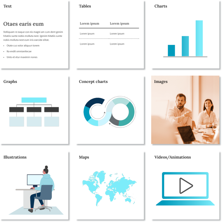
Types of visualisation

Text slides

A clear text structure helps your audience understand your presentation. Break up long lists under separate, logical headings. Use as few words as possible and avoid continuous text. Otherwise, your audience will be concentrating on the slide rather than on you, the speaker.

Tables

Only use tables when you really need to show and discuss specific data. Some situations, e.g., trends, can be communicated much more effectively using charts. If you do use a table, show only the most relevant data, so that the slide is easy to read and understand.

Charts

For tips on choosing the right type of chart, see our separate blog post. Charts are ideal for revealing data relationships. You can highlight important aspects, such as a change in trend or a phase of continuous growth, with appropriate formatting.

Diagrams

Diagrams use nodes and connecting lines to display relationships between several elements. Examples include organigrams, family trees or route maps for public transport. To make them easy to follow, ensure similar elements show the same formatting, e.g., use the same size and color for those showing members at the same responsibility level on an organigram.

Concept charts

Concept charts illustrate processes and the relationships between elements in a system. To find the right type of chart, use the key words in the text as a guide. For example, ‘”in three steps” or “in four phases” would indicate you need to use a process arrow chart.

Images

With well-chosen pictures, you can catch your audience’s attention, and make your presentation more appealing and convincing. Remember, less is more. Leave out merely decorative images and use a few, carefully selected images that underscore your content.

Graphics

Graphics, such as pictograms, are symbolic representations of objects or information. They can also help to structure presentations and guide the audience through complex topics.

Maps

If you want to illustrate geographical relationships, customized maps enable you to highlight precise regions. Google Maps and other mapping software can also be very helpful here. For example, you can position the logos of your customers or competitors on the map.

Videos and animation

Targeted, minimal use of animations allows you to build up complex illustrations step by step. Embedded videos can be an effective way to anchor messages and let others contribute or have their say.

weiße Oscarfigur

Creating compelling presentations using the OSCAR principle

Creating compelling presentations using the OSCAR Principle

Reading time 2 minutes
What is it that actually makes a presentation compelling? We already asked ourselves this question many years ago (and continue to ask it). It essentially comes down to just a few criteria, which we’ve summarized into what we call the OSCAR Principle. If your presentation meets these five criteria, it might not win you an Academy Award, but it will achieve your desired outcome.

And the winner is … five criteria for compelling PowerPoint presentations

OSCAR - Five criteria of successful presentations

Why are these five criteria so important when you’re creating a presentation?

Organized – People need orientation. A clear structure and a logical composition allow your audience to follow your line of thought and understand what you’re getting at. Your key statements become memorable.

Simple and easy to understand – You only have limited time to win over your audience. Reduce your messages to their key points. Be compelling, not through complexity but through perspicuity. Be absolutely clear. Then you’ll have your listeners on your side.

Concise – The more you reach the point of each message, the better your listeners can relate to them, and the sooner they can accept them. Even if it means you’ll have to spend more time creating each slide ― the extra effort will definitely be worthwhile.

Appealing – Presentations serve to accompany your talk visually and to support it. The clearer the design and composition of your slides, the faster your message will be understood, and the more likely your listeners will be to actually look at your slides. Besides, your listeners will inevitably base their opinion of content quality on the perceived quality of the packaging.

Relevant – Be absolutely clear on the expectations and the interest levels of your target group. The most beautiful slides are useless if they don’t connect with your audience. How knowledgeable are your listeners, what is their attitude towards the subject? Customize your presentation to your audience to be truly compelling.

Think about the presentations you’ve already created. Would each of them deserve an OSCAR?

Achim Sztuka Strategy Compass

4 questions for CEO Achim Sztuka

4 Questions for Achim Sztuka, CEO Strategy Compass

Reading time 4 minutes
Achim Sztuka CEO Strategy Compass

1. What personally motivated you to leave a secure job at a corporate group and start your own business?

I had been keen to have my own business for a long time. Ever since interviewing various business founders as part of my thesis at university, in fact. Coupled with this was the fact that, in my previous jobs, I had noticed that what I had considered to be right wasn’t necessarily what ended up happening – sometimes to the great long-term detriment of my employer.

That doesn’t mean to say I didn’t enjoy my previous jobs as a business consultant and as a strategist for a corporate group – on the contrary. But I’m not a huge fan of company politics, as I like getting down to actual business. I believe in putting into practice the things I consider to be right. And I realized that, at the end of the day, the only way that can work is if you take control of your own destiny.

This is incidentally also one of the reasons why Strategy Compass has no investors, and is kept privately owned. Only then do we actually have the freedom to live this dream.

2. So, why set up a business providing an add-in for PowerPoint?

Well, you need some sort of idea to start things off (laughs).

The idea ultimately ties in very closely with my previous professional experience. Whenever something important was due to happen, it would involve PowerPoint. This was a given in business consultancy, but it also applied at the corporate group: Whenever I wanted to convince the management of something, I needed a good presentation.

And then there was the practical side: When I started my first job at Roland Berger Strategy Consultants, I was prepared very well when it came to presentations: As part of the orientation, every consultant was sent for a two-day training course to learn the basics of good management presentations. During projects, we would scribble our slides on paper and fax them to the graphic design department, which would send us back slides which were more or less ready to use. And there was an internal add-in for PowerPoint which helped us create our own slides faster and more effectively.

All this “infrastructure” went out the window when I moved to the corporate group. No tool, no graphic designers, no trained team. I had to create all my slides myself, using only PowerPoint. That was not fun at all (laughs).

The QuickSlide product we offer today, with its accompanying portfolio for presentations, was devised by drawing on old knowledge from my time as a business consultant. We picked up on these approaches and further developed them.

Another factor of course also played a role in my decision: The notion that, no matter where you look, almost all presentation problems are quite similar. This served as the basis for our business idea – a field my co-founder and I were very familiar with, where I had already gained a lot of experience, and where we were able to enjoy the work and change things for the better.

3. Do you guys think you’ve actually developed a better form of PowerPoint? In other words, could your software work without PowerPoint, in terms of logic?

Gosh (pause). Based on how we see ourselves, it’s a bit different. For a start, PowerPoint is a tool that works well. But it could just as easily be called Keynote or Open Office. It really doesn’t matter. The main thing is that PowerPoint is a tool which provides a number of different options and enables complete standardization: Every school student uses the same PowerPoint a company executive does.

But if you’re in a business context, there are some challenges that PowerPoint struggles to meet. It lays the basis, so to speak, but isn’t yet able to get things quite right, because a lot of things are missing “on top”. As such, we don’t see ourselves as being the better PowerPoint, but rather as a means of equipping PowerPoint for business contexts. This is something Microsoft is yet to do, and little has changed in the last fifteen years.

And after all, it’s not just a question of software. We’re not about making PowerPoint better as software; we’re about the goal behind it – the goal of enabling people to achieve more with their presentations, be it in brand communication or in pitches to decision-makers or customers. All kinds of aspects come into play here; it’s not merely a matter of software. That’s why we follow our own unique path – of being not only a software company, but, with our high degree of expertise, also consultants and a design agency.

4. Was it difficult to become an official Microsoft development partner? How long did it take?

It’s not actually that difficult at all to be admitted into the normal partner program. If your company is in the right business, access is very easy. In our case, however, we’re not just a Microsoft partner; our QuickSlide PowerPoint add-in itself is also certified. And that of course only works if your development processes are in complete compliance with Microsoft standards.

When we got started with QuickSlide, we were aware right from the outset that we would rely on Microsoft. Neither my co-founder nor I are developers; we come from the user’s side. So we looked around to see who was the best programmer we could get. We managed to secure Dr. Pfeiffer, who was THE PowerPoint developer in Germany at the time. We made sure we took note of everything that needed to be noted, so the QuickSlide certification process went relatively smoothly. Even this step wasn’t that difficult – though others would probably have had more trouble… (laughs).

Logo "eLearning Africa"

A presentation workshop of a different kind in Mauritius

A presentation workshop of a different kind in Mauritius

Reading time 2 minutes

For several years, Strategy Compass have been supporting EAST, a non-profit organization dedicated to developing education, health and entrepreneurship in Africa. At the heart of its activities is the annual “eLearning Africa” conference. This event brings together people from all over Africa and beyond who can and want to bring about change. Although we’d previously only made donations, the organizers kindly invited us to actively participate in one of their conferences. 

So, I went to Mauritius to hold a workshop with an exciting group of teachers, trainers, professors, ministry workers, business owners, and other dedicated participants who all wanted to know how to achieve even more impact with their presentations. Normally, our training courses are designed for managers, specialists or consultants from the business world. This meant I had to spend quite a bit of time preparing relevant content for this occasion. 

The workshop was well worth it, both for the participants and for me. Here’s a brief list of what I learned from my preparation ahead of the event, and discussion with participants: 

  1. Everyone is battling the same problems
    The challenges we face when creating presentations in a business context are largely the same as those in an education context. And the situation in Africa is no different to Europe or the US.


  2. Relevance is king
    No matter who my presentation is for – unless my content and messages are of interest to my audience, and fit with their situation and environment, they’ll have no impact at all.
  3. Messages are often hidden
    It was proven to me once again: What you initially consider as your presentation’s key message is rarely what the message actually should be – when you think it all through properly.
  4. Pyramids are great
    Whether I’m substantiating a core message with arguments or logically breaking down learning objectives and content, Barbara Minto’s pyramid principle is extremely useful. While providing structure up front is also crucial in learning-based situations, summaries typically come at the end.
  5. Design principles are universal
    Anyone can design good slides using a few relatively simple principles. Perhaps not on their first attempt, but at least during the review cycle. And these same basic principles apply all over the world (at least in my experience). 
presentation workshop Mauritius

Apart from the workshop itself, it was great to spend three whole days engaging in discussion with over 700 interested participants as to how learning and technology can change the lives of people in Africa. Thank you to the organizers for this fantastic conference! 

Achim Sztuka 

PowerPoint-Format

PowerPoint format 4:3 vs. 16:9

PowerPoint Format 4:3 vs. 16:9

Our questions, your choice

Reading time 6 minutes

A while ago, we expressed a preference for the aspect ratio format 16:9 over 4:3. Since then, we’ve re-considered arguments that didn’t seem relevant at the time. Here we weigh up the pros and cons, with a structured guide to help you choose for yourself.

Why exactly?

Originally, there were 4:3 monitors. Then manufacturers realized that the 16:9 format covers the human field of vision a lot better. So, devices changed, and consequently, so did presentations.

But is that a strong enough argument to change course at your company? The following nine questions can help.

PowerPoint Master
1) What’s your main reason for creating presentations?
  • Primarily for sales or business pitches?
  • For presentations at major events?
  • Perhaps more for internal meetings?
  • As reports or handouts?

Or is it all of the above? The larger the company, the more varied the use of PowerPoint. Concentrate on what’s most important to you. This will serve as your basis.

2) What equipment do you use?

Based on your most important uses, work out which output devices are most prevalent in each case.

  • Does your sales department work mainly with laptops and projectors – i.e., more in the 16:9 format? Or are your colleagues often on the road with tablets? If so, consider the model they use here; the iPad uses an aspect ratio of 4:3.
  • Do you use large monitors at events or trade fairs? What type? From extremely wide screens to upright columns, the possibilities are endless.
  • Are your projectors state-of-the-art (16:9) or does your equipment vary, and you still use some older devices (4:3)? Consider not only the head office, but also local branch offices, meeting rooms, etc.
  • Do you frequently print out presentations? Are they often distributed as handouts? This would tend to favor the 4:3, including for A4 or letter format.

3) What image do you want to convey?

Formats do contribute to your overall image. Many users now see the 4:3 as being a bit outdated, whereas the 16:9 shows you’ve kept up. This argument can trump all other questions, such as those regarding equipment, technology or print-outs, and applies to both the internal and external image of your team or organization.

4) Which PowerPoint format is better suited to your content?

Let’s get rid of one common claim for a start – the 16:9 doesn’t offer you more space per se than the 4:3. More space is created if the format is a good fit for the output device, and optimally utilizes the device’s available space. Besides adaptation to the output device, other factors can also play a role. If, for example, you use presentations as manuals and want to display a screenshot on the left and an explanation on the right, you can achieve this more easily with a wider format. When it comes to presenting detailed content, however, the good old 4:3 is still suitable, as it provides roughly the same amount of space on all sides.

5) How many formats do you want to provide?

If you can’t decide, it’s best if you offer all options, right? If you do this, you need to be really organized. If you offer everything without proper planning, you’ll end up with chaos, as everyone just uses their own preferred format. Try collating multiple staff members’ slides into one presentation with this approach. The result: too much time spent on adapting individual slides, inefficiency, dissatisfied users, even damage to your brand. Choose a base format and build on this by establishing clear guidelines as to which format will be used for which purpose. You’ll then be working with a tool that converts the slides to the desired format quickly, and with minimal loss, at the press of a button.

6) How do you convert?

Conversion PowerPoint slides

You’ve decided you want to change something, because you’ve considered each of the questions on their own merit. Our tip: Develop a migration plan. Bear in mind that each of your colleagues are likely to have a stash of old presentations they keep reusing or which serve as their basis for new presentations. This means conversions can quickly become irritating and cause issues. A conversion is most likely to be accepted if it occurs simultaneously with a general design conversion, brand relaunch or template conversion. No one questions these!

Most companies have more slides in circulation than they realize. Sometimes millions. The consequences, time, effort and costs involved, and the project itself are all hugely challenging, making a migration plan all the more important.

7) Which 16:9?

Did you know PowerPoint has two different 16:9 aspect ratios? One is known as “On-screen Show (16:9)” in PowerPoint 2016. The other is “Widescreen (16:9),” which has been the standard since PowerPoint 2013. The former is the same width as the 4:3 format (in the standard PowerPoint dimensions), while the latter is the same height. The space on the screen is exactly the same, though you generally need a smaller font size for the older “On-screen Show (16:9),” to give yourself enough space for content vertically. The newer “Widescreen (16:9),” on the other hand, usually works very well with the font size used in 4:3. The vertical PowerPoint size does not change, so the text can simply run on longer across the width. This also makes it easier to copy content quickly from old 4:3 slides; while a few unsightly blank spaces remain at the sides, the rough fit is good in terms of height. For this reason, we almost always recommend the “Widescreen” option.

8) How do you handle a possible conversion?

“The faster the better” is the general rule. Long transition phases make everyone work differently, so then you have to revise and rework things all over again. However, it’s worth thinking about the areas where a transition phase is wise, as it’s just as inefficient to create work where it’s not needed. When we assist our customers with the conversion process, we try to get onboard as early as possible to ensure optimum preparation and user support:

  • Designing the new master(s) smartly – in terms of the conversion itself and the future
  • Having as much useful material as possible in time for the go-live – Slide templates, modules, new corporate and sales presentations, tips and tricks
  • Tools to automatically convert old presentations
  • A conversion service for greater acceptance and efficient, professional conversion of important presentations

9) How much of the conversion can be automated?

Having discovered that all previous solutions available on the market (including our own) were unable to deliver what users really needed when it came to format switches, we spent several months on developing a completely new automation solution. This incorporates not only our entire gamut of developer expertise, but also all our experience from countless conversion processes. The result was a conversion tool that can automatically create new, reasonable-looking presentations out of most of the old ones:

  • The presentation is set in your new target master from a pre-defined source master – with great precision
  • The layouts are reallocated. In doing so, the tool utilizes the advantage offered by PowerPoint when users have worked with layouts and placeholders the way they should. But – and this is the smarter part by far – it can also handle the often much greater number of presentations in which layouts have been copied wildly and placeholders moved at random.
  • Next, the slide content is smartly adjusted to the new aspect ratio. This includes various methods for scaling and repositioning items on the slide. Text is scaled, and images are not distorted.
  • Depending on the requirements of the old and new masters, various corrections are then performed automatically to ensure the rest of the look also complies with the new specifications.
  • There is literally no ready-made solution for this. The conversion tool is configured individually for each customer – based on old and new masters, what the user does with them, and how the marketing department intends to use them.

This type of migration plan for PowerPoint conversions requires a holistic approach, lots of experience, and application expertise. In return, however, it promises a seamless conversion, a high degree of acceptance among users, a good reputation, and the speed marketing departments dream of. What it also needs is preliminary talks early on, the right questions, reliable analysis, and intelligent, personalized implementation. The preliminary talks alone provide great food for thought which can also genuinely boost efficiency in cooperation with the hired brand agency.

Paragraph

Image licence rights – What to look out for

Image licence rights - what to look out for

Reading time 3 minutes

Visual elements like photos and infographics add value to your presentations. They can support and enhance your content. They can convey messages instantly. They can make a presentation more appealing and interesting and provide visual orientation. Many companies define their own visual language as part of their corporate design. Many also have their own image database with a selection of very good photos that they own. Still, you might be faced with a situation where you have to spend time searching elsewhere for the right picture. 

Beware of photo stock pitfalls

First, you need to find the right image. This can involve a lot of effort. Where do you even start? Then you need to check that the image quality is as decent as advertised. Does it fit your brand and the message of your presentation? Even if you think an image is perfect, you then have all the legal aspects to consider. What’s permitted? What’s not allowed? The issue of image selection is complex. 

The right to use an image

Beispiel für Stockphoto

This is where it gets even more complicated as we outline the completely different levels and perspectives for image rights.

To begin with, there are the photographer’s rights regarding the image itself, to stop it from being stolen, copied or displayed without their official permission. These factors are protected by international law, as well as individual countries and regions having their own laws and regulations. Then there’s the photographer’s right of personality, fulfilled by crediting the origin of an image. Distorting or changing an image in any way is also prohibited by law. And, of course, there’s standard copyright as an intellectual property law, and license rights. Plus, different levels of rights by agreement with the individual agency.

Photo stock agencies

Most often you’d search for images via a photo stock agency. These can roughly be divided into macrostock, midstock and microstock agencies. Macrostock agencies tend to deal with rights-managed (RM) licenses. They’re usually exclusive images, of premium quality and taken by professional photographers. You buy the right to use them just once. Microstock agencies tend to offer royalty-free (RF) licenses. After purchasing the image (often by amateur photographers), you can use it indefinitely with no specified limits on purpose for usage. In parallel to this are topic-oriented image agencies  universal agencies, press agencies and specialist photo stock agencies. The latter are those that actually specialize in themed photos, such as food, sport, business. Finally, there are loads of free agencies. 

Getty Images, Sipa Press or Corbis are examples of macrostock agencies. Shutterstock or Fotolia are midstock agencies. iStock, Dreamstime, Photocase, Pixelio are called microstock agencies. To give you an idea of costs, macrostock agencies tend to start at around 130 USD per image, midstock charge anything between 15 to 130 USD, and microstock will set you back between two and 15 USD. But look at each case individually and ask a specific agency for a quote before you commit to your purchase. 

Licenses and rights

To be on the safe side, it’s best to answer a few key questions honestly to make sure you’re on the right side of the law regarding your chosen pics: 

  • Did you purchase the images correctly for all the channels you intend to work with? Did you read the fine print, e.g., specifying usage time periods or type of ownership? 
  • Does the agreement stipulate that you have to credit image origins? If so, did you? This is a common requirement especially for editorial publishing. It’s not enough to obscurely list them in the metadata. 
  • What’s shown in the picture? Are people recognizable? Or trademarks, brand names or works of art? Anything a third party could lay claim to? Be careful here and either clarify these rights in advance or touch up the image to eliminate those elements. 
  • Are the people in the picture aware what the photo will be used for? Make sure you have their permission, for instance, via signed forms. 
  • Were all outdoor shots taken while on public grounds? 
  • If you’re an advertising agency, remember to list your clients as licensees. Otherwise, you might be in for a shock when the photo stock agency doesn’t recognize them as authorized users, and your clients aren’t going to appreciate that very much either. 
  • Will the images be used again or in a different context? For example, in a print brochure made available as a downloadable PDF? If so, clarify if the additional use would be considered as a new item for purchase or just a “citation” of the original item. If it’s latter, then all is fine. 

Every photo stock agency has its very own license rights and terms and conditions. Tedious as they might be, you need to read them! 

Infringing image rights is easily done, but if you do so and receive a warning, the cost can be high – very high. If, legally speaking, you’re a company, and not a private entity or person, then there is no such thing as “on the fly” or “just this once” for all your PowerPoint presentations. Don’t even think along those lines. Legally, you won’t get away with it. 

We’re not providing official legal advice here – the world of image usage rights is far too complex. This post is to make you aware of the possible risks of not purchasing and crediting images in the right way. The next time you choose an image for your presentations and other communication channels, keep the above tips in mind, and contact the specific photo stock agency about the exact image you want to use and how. The agencies and their lawyers take image rights very seriously. Please do the same – it will only take a moment. 

Briefpapier

Your PowerPoint presentation as a handout

Your PowerPoint presentation as a handout

Reading time 3 minutes

At some point, you may want to hand out your presentation in paper form or perhaps electronically. This may sound simple, but there are a few things you should consider first. In our experience, there’s more to this than simply clicking “print” or “attach file”. Why? As is so often the case – the devil is in the detail.

Handout

When might you want to use a handout?

When might you want to use a handout?

  • As advance information prior to a particular presentation
  • As a reminder, after the presentation has taken place
  • Immediately before the meeting or seminar begins, so that people can make notes during the presentation/event
  • To give to a conference organizer in advance for their approval, or so that they can circulate it to the participants

Does there always have to be a handout?

Although a handout might seem to be a fairly insignificant by-product of your PowerPoint presentation, it’s still important to think about the aims and tactics of using one. If you want to provide a handout, here are some general thoughts and questions regarding the right time to circulate it and the psychological aspects.

In general

  • Do your printed slides speak for themselves? Perhaps they’ve been designed to provide a visual accompaniment to your presentation. Experience shows that a presentation often doesn’t work well as a handout, and that you have to edit and expand your slides into a usable handout.
  • What about the background you’ve chosen for your slides? Is it suitable for printing and making notes on, or is it too dark?

Before, during or after – according to the situation

  • meeting organizer wants to see your slides in advance. Just to check that you’ve followed his briefing instructions, and so he can prepare a download or handout to circulate to participants. That’s understandable, but you should still ensure that your presentation is not made available to participants before the date itself, so you don’t end up giving a talk that everyone already knows.
  • You circulate your presentation in advance as a kind of agenda, so that everyone knows what it’s about and what to expect. Please don’t! Make the effort to prepare a separate agenda. Nobody is really interested in hearing about something that they’ve already read. Furthermore, they might not have interpreted your slides as you intended, and may come to the presentation with false preconceptions or with their minds already made up. Reversing this will cost you a lot of energy.
  • You circulate a handout of your presentation immediately before you begin. Consider carefully whether this is appropriate in your particular presentation situation. You can be sure that your audience will immediately start leafing through the handout and anticipating what you’re going to say, instead of focussing on you and your presentation. It might be better to distribute paper copies of particular slides as and when you need them. To illustrate or support a point – or simply as a dramatic device to physically focus the audience’s attention onto something important. Ensure that the slide layout gives people space to make notes. In the case of longer training seminars, it may help participants to have the most important slides at the beginning, e.g. as two-to-a-page handouts with space for notes. Remember, though, that making things easy for your audience generally means they retain less of what they should be learning: the physical process of note-taking helps people commit things to memory.
  • You circulate your presentation after the event as an aide memoire. Remember to edit it accordingly (e.g. with your contact details on the last slide) and make sure the printout is easy to read.
  • If you want to distribute your presentation after the event in electronic form, a PDF file is a good choice. Depending on the situation and the recipient, it might be a good idea to add a footnote with your copyright. Just to be on the safe side.

Although providing a handout seems a simple enough idea, you should definitely give it some prior thought. It can help you attain your presentation goals – but when used incorrectly, it can hinder you. Don’t leave things to chance!

Orientation

Use orientation to gain and maintain attention

Use orientation to gain and maintain attention

Reading time 2 minutes

Orientation: a basic need

Humans are complex creatures. Yet, in some ways theyre pretty simple. Just by following a few basic rules, you can really help your audience to concentrate on your presentation. And what’s great is that applying these rules helps drive the success of your presentation, without any effort needed from your audience. An easy-to-use approach is Abraham Maslow’s hierarchy of needs. Maslow suggested were only able to immerse ourselves in something if were first reassured that all our basic needs are being met. 

Will I go hungry?

To give you their full attention, your audience members need security. They need to know where the nearest restrooms are, and that they won’t go hungry or thirsty during the meeting or event. They also need other details: How long is this going to take? Where are we exactly? Who’s that at the front? Who are all these other people? 

orientation in presentations

This might sound obvious, but if just one of these queries hasnt been completely resolved in the minds of your audience, their attention is going to wander. You, as speaker, will have to battle against a front you’re barely aware of, and it’s going to cost you energy to keep everyone’s attention on your presentation. 

Piktogramme

Create a feeling of security

Prior to your presentation, spend some time sorting out mundane things, such as signposting the meeting room and opening doors. If your audience isn’t familiar with the location, make sure there are clear directions and signs for restrooms and checkrooms, as well as fire exits.  

Explain where everyone can get themselves something to eat or drink, or where and when refreshments will be served. State the times of planned comfort breaks. Clarify the rules – is it OK for people to get up and help themselves to food and drink during the presentation, or should they wait until a set break? 

Suggest rules for asking questions and generating discussions throughout the presentation – or maybe limit this to the end, depending on the context and your goals. State the agenda and sequence of topics – but if you specify times, stick to them! If you run overtime for any section, your listeners will become restless. You’ll lose their attention.  

If participants don’t already know each other, briefly refer to the people sitting in the room. For instance, “It’s my pleasure to welcome 50 IT-specialists from the pharma industry who …” If there’s a full list of participants, mention it. If you’ll provide a handout or download details after the presentation, tell your audience up front, or suggest they take notes on anything they consider important. 

And you are?

Our society dictates that modesty is a virtue, but you should at least explain to your audience who you are, and why you have the expertise to stand at the front and speak. Be clear about your role. Then no-one in the audience needs to question whether to believe you or not. That said, keep this part brief. You audience needs orientation, but not your whole resume! 

Not a saber-toothed tiger in sight

Orientation is a basic need. It gives us the security we need to concentrate on a particular situation, subject or speaker. No one has to worry about a thing, because that archaic part of us feels safe in the knowledge that our basic needs are being met, and there’s no saber-toothed tiger prowling up the corridor.