Strategy Compass Logo AddIns for Microsoft Office
Search
Close this search box.
Woman presenting

How your voice influences your presentation

How your voice influences your presentation

Reading time 4 minutes

During a presentation, the audience hears and interprets the speaker’s every spoken word. They perceive every gesture, every look, every change in posture, every modulation in voice, and every emphasized phrase as messages. And sometimes, the body can unknowingly express something other than the wording of their speech. A top presentation is one in which the overall expression is cohesive, i.e., if the verbal language, voice and body language all say the same thing as the text itself.

Here, we’ll look at how our voice impacts our presentations.

The spoken word structures the topics and gives your audience the opportunity to properly understand contexts and follow you and your presentation in all its complexity. Even the driest subject can be rendered exciting through the use of a lively voice, timbre, pitch, presentation speed and well-placed pauses.

Voice

Articulation

Practice articulation; read something from a book or newspaper, speaking exceptionally slowly and clearly. Be mindful of the fact that your audience will be hearing the presented information for the first time. Just for fun, place a wine cork between your teeth and say, “How now brown cow.” Or, “She sells seashells by the seashore.” As loudly as you can. It was by applying this method (or putting pebbles in the mouth, though these were rarely accessible) that Demosthenes became one of the most famous orators of his time. Before that, he had mumbled away quietly and inarticulately. It’s a case of developing clear vowels and taking care not to swallow consonants. Observe yourself and see what each vowel does to your facial muscles and the shape of your mouth. Get a sense of the difference between a round O and a U or the “ow” in “brown cow,” and be exceptionally clear, because the sequence of consonants and vowels will then be very deliberate.

Volume

The volume of your voice conveys energy and power. But that doesn’t mean you should shout loudly across the room. Try the following: Stand upright. Feel your feet on the floor. Anchor yourself and imagine you are a tree with its roots in the ground. This will give you a confident stance. Now get a sense of your breath. To do this, place one hand on your chest and the other on your belly. Feel where your breath goes … then practice very deliberately breathing into your belly, in such a way that your chest and shoulders do not rise up as you breathe, but rather your stomach pushes out on the inhale (not the most attractive look for the moment, but healthy nonetheless) and goes in again on the exhale.

Voice and voice volume are created by combining many of the body’s tools, including the diaphragm, your vocal chords, the orifice of your mouth and throat, your breath … Did you know that good abdominal breathing also influences your autonomic nervous system? It makes you calmer. And when you’re calmer, your voice gets deeper. Chest breathing/shallow breathing and nerves make your voice higher. And the higher your voice, the less you’ll convince your audience of your competence and expertise. Next time you are part of an audience yourself, close your eyes and just concentrate on the presenter’s voice, their timbre, their breathing. You can even try it when you’re on the phone. What you hear will amaze you.

Woman presenting

Pitch of the voice

Everyone has a neutral pitch; the tone and pitch that come naturally when you’re feeling at ease and the vocal chords are relaxed. Most of us lose contact with it. Because we lapse into shallow breathing, are hurrying or nervous, perhaps because we want to convey a sense of toughness or dynamic management traits. But it’s at this precise neutral pitch that you appear more authentic and competent. Try the following exercise: Adopt the rooted tree position (as described above). Breathe deeply into your stomach. Calm yourself. Now try to hum to yourself. From top to bottom. And get a sense of where you feel most comfortable. You may need to try it a few times as we’re no longer used to doing this, but it’s actually very simple. Just like when we say “mmmm” if we eat something tasty. And at this exact point, say any simple little phrase. Once you’ve done this a few times, you’ll generally feel you’re able to speak without straining at all.

These small tips of course only scratch the surface of the topic. The most important thing is to get back in touch with yourself and thus be more aware of your own voice or, by observing others, more consciously notice the voice as a tool. Because who already does that in everyday life?

The breath and voice are incidentally two aspects we intensively focus on in our presentation training.

Structur of presentation illustration

Creating successful presentations – Structure

Creating successful presentations

Part 1: Organized presentations

Reading time 8 minutes
Präsentationsbearbeitung am Notebook

Presentations are a standard format for both internal and external business communications. A well-planned presentation can help inspire clients, convince decision-makers, and even boost your career by proving your management skills. On the flip side, just one poor presentation could ruin a business, a reputation, or your own professional opportunities.

Create professional presentations using the OSCAR principle

When you create a presentation, the most important factor to bear in mind is that your audience will follow you throughout. Unless they keep up with your train of thought, there’ll be no chance to achieve your objectives of presenting to them in the first place, usually to impress, convince or inspire them.

When you next create a presentation, keep the acronym OSCAR in mind:

O – organized – create a clear, solid structure for your whole presentation
S – simple – keep your slides clear and easy to follow
C – concise – remember, less is more, too much is confusing and boring
A – appealing – style and visual elements should be consistent throughout
R – relevant – your slides should resonate with your audience

Oscar Icon

Devise a clear framework

Your presentation’s structure plays a key role in its overall success. What’s the point of being a charismatic speaker with attractive slides if the whole presentation sequence is confusing? Your audience, whether two people or 200, must be able to identify the structure and links between various presentation components quickly. Your key recurring theme must be clear throughout the whole presentation so your audience will stay with you.

Before you design any individual slides, it’s important that you give enough thought to the entire presentation structure, from start to finish. C-level audiences particularly expect logically organized presentations. They’re usually pressed for time and want to grasp key messages quickly. A methodical structure also helps you to memorize and navigate the presentation sequence more easily. This makes the whole presenting experience smoother and more impressive for the audience.

PowerPoint tops the charts for presentation software usage:

There are around 500 million PowerPoint users worldwide.
350 new PowerPoint presentations are started per second.
That’s around 30 million presentations every day!

Basic structure

You can organize your presentation in several different ways, depending on the topic and target audience.

The basic structure is always the same, with these three parts:

  • Introduction
  • Main body
  • Conclusion

This might seem obvious, but this simple rule forces us to think about how to broach the topic and what we want to show at the end, after the main body.

Introductions - Get off to a good start

Introduction of a presentation

Gentle introductions

This is where you warm up your audience with a few slides covering their prior knowledge or the status quo. Content on these slides should always be very simple or even familiar for your audience. This lets you slowly guide them to the core message of your presentation. Listeners must agree with all the points up until a challenge or complication is raised, along with any associated questions.

Gentle introduction structure

  1. Situation: The stable, known state. A brief overview of developments over recent months or years till now, or the current status.
  2. Complication: Something has happened or could happen. This indicates a possible change to the known situation.
  3. Question: How can or must we respond to this?

Powerful introductions

Start with a statement that surprises or shocks your listeners. This instantly grabs their attention and ensures they’ll want to hear more. The “shock” can be a statistic, a quote, a short story with a surprising outcome, a fascinating piece of information or even a thought-provoking question.

Whatever you choose, your powerful introduction must be

a. factual – or it won’t be easy to regain your audience’s trust

b. relevant to your audience – or you’ll struggle to keep their interest and attention

Powerful introduction structure

  1. Situation: Something has happened or could happen: Research findings, the outcome of an event or a recent interview revealing key updates to start off with.
  2. Complication: Possible consequences. What does this mean for us or you?
  3. Question: What can we do about it? How could or should we respond?

Body - The core of the presentation

This is where you can expand on the key topic of your presentation in more detail. Your audience will be keen to know what you want to tell them, and what impact this could have on them, now or in future.

Make sure the order of your slides is easy to understand and follow and guide them through your points systematically. Think of any questions they might have, then add – or delete – content or whole slides as necessary for more clarity.

Conclusions - Skillfully ending presentations

Conclusion - last page of a book

The conclusion is the most exciting part of your presentation – and it’s quite easy to structure. This is where you address your listeners and formulate your core statement. This structure works well for most presentations:

  1. Summary of points and results
  2. Conclusion – what does this change or imply for us?
  3. Next steps – which concrete actions can we/you take now?
How big should my presentation be? Think of the time slot you have, e.g., 15 minutes to present. Then decide what the scope of the presentation should be.

Common presentation structures

You have two main options when creating your presentation: To mention the core message at the start (pyramid structure) or at the end (funnel structure).

Pyramid structure

If you reveal your core message very early on, your audience will be curious as to how you got there or what exactly you mean by it. This prompts a kind of question-and-answer dialogue, which lets you lead them through the process step by step. This makes it much easier to attract audience attention and ensure everyone follows you on your train of thought. This structure is often used when presenting to C-level managers as it’s seen as a more logical sequence for presenting facts and considerations.
Pyramid structure Icon

Pyramid structure example

Jake Scott is the Head of Strategy at sports equipment manufacturer X-Treme Sports. To further accelerate the company’s ambitious growth and become number one on the market, he proposes taking over competitor Fun Sports Enterprises (currently number five on the market). He wants to convince the executive board of this idea at the next strategy workshop.

How could he structure his presentation?

Jake knows the executive board is interested in all ideas that support the ambitious growth target. He also knows the executive board is open to acquisitions and is already looking for possible suitable candidates. So, Jake decides to mention his core message, “We should take over Fun Sports Enterprises,” at the start of the presentation, and then provide answers to the logical follow-up questions. He opts for a pyramidal structure with the respective core statements for each subsection:

Introduction

  • Situation: We have an ambitious growth path.
  • Complication: We won’t reach our targets through organic growth alone.
  • Question: What else could we do?
  • Core statement: We should take over the competitor Fun Sports Enterprises.

Body

Argument 1:

We will only be able to reach our growth target through a larger acquisition.

  • Fact 1.1: Taking market shares off competitors requires a lot of time and resources.
  • Fact 1.2: Excessively fast organic growth would lead to a price war.

Argument 2:

Fun Sports Enterprises is a suitable takeover candidate.

  • Fact 2.1: Fun Sports Enterprises fits with our strategy.
  • Fact 2.2: We expect a low purchase price.
  • Fact 2.3: Both companies can be merged without any major difficulties.

Conclusion

  • Summary of results: We have seen that …
  • Conclusion: That’s why I am proposing we take over Fun Sports Enterprises.
  • Next steps: We will hire an investment bank to help us.

Funnel structure

If you mention the answer at the end, as part of your conclusion, it’s harder to maintain the dialogue with your audience from start to finish. Plus, if you make a key statement at the very end your audience might not be convinced that they can accept it. They’ll be forced to go over your previous statements and will have to consider if they support the core message or not. This structure therefore doesn’t work well when presenting novel ideas or a whole new approach.

Cases where a funnel structure does make sense are when a topic could be controversial or emotionally charged. If you leave your delicate core message until the end, you can avoid heated discussions from cutting into your valuable presenting time – and opportunity to convince anyone – right from the start. In situations like this, you could end your introduction with a (rhetorical) question and then lead your audience through consecutive statements which eventually lead to your concluding core message.

Funnel structure Icon

Funnel structure example

Jake Scott is the Head of Strategy at sports equipment manufacturer X-Treme Sports. To further accelerate the company’s ambitious growth and become number one on the market, he proposes taking over competitor Fun Sports Enterprises (currently number five on the market). He wants to convince the executive board of this idea at the next strategy workshop.

How could he structure his presentation?

Henry knows the executive board is split when it comes to opinions on takeovers. Several past attempts to take over competitors have failed. Several executive board members are especially critical of Fun Sports Enterprises. To ensure his proposal is viewed objectively, Henry decides to only mention it at the end of the presentation. He devises the following structure with the respective core statements for each subsection:

Introduction

  • Situation: We have an ambitious growth path.
  • Complication: We won’t reach our targets through organic growth alone.
  • Question: What else could we do?

Body

Topic 1:

Growth through acquisitions

  • Fact 1.1: Taking market shares off competitors requires a lot of time and resources. Acquisitions are a faster option.
  • Fact 1.2: Excessively fast organic growth would lead to a price war. Acquisitions avoid a price war for market shares.

Argument 1:

A suitable acquisition would enable us to achieve our growth targets quickly.

Topic 2:

Conditions for successful acquisitions

  • Fact 2.1.: The takeover candidate needs to fit with our strategy. Fun Sports Enterprises meets this requirement.
  • Fact 2.2: The purchase price has to be right. Fun Sports Enterprises meets this requirement.
  • Fact 2.3: It must be possible for the two companies to merge without any major difficulties. Fun Sports Enterprises meets this requirement.

Argument 2:

Fun Sports meets all the requirements for successful acquisitions

Conclusion

  • Summary of results: We have seen that …
  • Conclusion: That’s why I am proposing we take over Fun Sports Enterprises.
  • Next steps: We will hire an investment bank to help us.

Quality check for presentations

How do you know if you’ve done a good job with your presentation structure? Use these four quality criteria as a checklist at every structural level:
Statements made at this level are

  1. Consistent
  2. Not overlapping or repetitive
  3. Concise and to the point
  4. Complete, and collectively represent the overarching statement. Every statement is a summary of those below it (at least two points). 

This can help you determine the quality of the points you want to make.

Checklist Icon

Summary

When drafting your next presentation, remember, establishing the structure is the most important and often most difficult part of creating it. A clear, tidy structure makes things much easier for your audience to understand and follow, and a whole lot easier for you to present to them.

Always bear in mind at least the basic structural elements and the core message you want your audience to hear. Depending on your content and the audience, you can choose from the different introductory styles. Keep your messages consistent and relevant so your audience will keep up with you, slide by slide.

viele Bilderrahmen

Easy to find: Search strategies for image databases

Easy to find: search strategies for image databases

Reading time 3 minutes
Images have a big impact. They can emphasize key messages and give them emotional weight – but they can also miss their intended purpose, for instance, if they’re too generic or don’t match the tone of the text. Given the millions of pictures available today in online archives and company databases, finding the right one isn’t easy. We’ve come up with five tips to help you pick the right pics: 

1. Search the right way

Test different terms and combinations of terms in your search. Start with a general one, such as “ship.”  If that doesn’t offer the results you’re looking for, try synonyms such as “boat.” Or try more specific terms, like, “sailing ship” or “yacht.” This often gives you completely different pictures. Finally, try thinking laterally, with search terms such as “sailing” or “cruise.” 

Image search strategies

2. Use other people’s ideas – Google and Bing

With abstract concepts such as “innovation” and “teamwork,” it’s often difficult to come up with ideas for images. Luckily, you’re not the first person to have come across this problem. Benefit from others’ creativity by using the Google or Bing images search to see what other people have used to illustrate these terms. If you search for “innovation” you not only find obvious pictures, such as a light bulb or a broad horizon, but also a picture of Otto Lilienthal, the aviation pioneer. This way, you can get a general idea of what you want to show for your topic and then continue with a more specific search, for instance, in your company’s image database (where you’re also on the safe side regarding image copyright). 

3. Filtering for better search results

If you know exactly what you’re looking for, you can narrow down your search using filter functions. Choose certain topics or limit the search to visual element types (photos, illustrations, pictograms, etc.) or orientation (portrait, landscape). Look at the options available such as drop-down menus or check boxes in the database you use. If your image database uses Boolean logic behind its search function, this lets you add the words “AND,” “OR” or “NOT” between search terms, so you can include or exclude certain search results. For example, search “innovation NOT light bulb” to exclude light bulbs from your innovation search results or “boat AND harbor” to find images showing both a boat (or several boats) and a harbor.  

4. Try free association

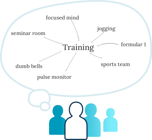
Free association is a bit like brainstorming. Take a blank piece of paper and write down the word or term you’d like to illustrate, for example, presentation training.” Then spend five minutes writing down all the associated words and expressions that spring to mindDon’t dismiss any term as unsuitable – it might lead you to another, more appropriate term. For example, training makes you think of sport.” Sport leads you to weight training,” which then gives you the idea of dumbbells.”  Perhaps dumbbells is exactly the image you’re looking for to get your message across. Free association works even better in pairs or groups of three – you can bounce ideas off each other in a creative development session. 

Free association

5. Get feedback

When you think you have found the perfect image, show it to at least three people for their feedback. Ask them what they associate with the picture, and what emotions it raises in them. Different pairs of eyes pick up details you might not spot. If you get three completely different answers, you should rethink your choice of image or even adjust your search accordingly. Sometimes, if you change a particular aspect of a picture using an image editor, you can sharpen your message. Also consider cropping – for example, you might find the perfect image of person to show in a summer brochure, but a colleague then points out that to their left in the photo there’s a window showing snow outside. Cropping away that part of the picture might deem the photo suitable to use after all.

Visualisieren mit Diagrammen

Visualizing data through charts

The dos & don'ts of visualizing data through charts

Reading time 2 minutes

The ability to make figures visual is the mark of a good presentation. It involves providing a fast overview, displaying complex content, and ensuring listeners follow you on the journey to important decisions.

When working with charts, the same principle as when designing slides generally applies:

  • Step 1: Precisely define the essence of your message to your audience
  • Step 2: Remove anything that does not serve this message
  • Step 3: Add anything that illustrates and conveys your message

Here are the dos & don’ts in an overview.

Step 1:

Do:

  • Write your core message in one sentence on your slide. This is actually the most difficult part of creating your slides.
  • Example: “First decline in sales of product XY in 2017”

Don`t:

  • Simply transfer your data from Excel or a database export to PowerPoint.
  • Use headlines such as: “Product XY sales development in 2017”. This is not a statement or message.

You can only create effective visualizations using clear statements and content which adds value.

Action title

Step 2:

Do:

  • Reduce all content in your chart to this statement
  • Rid the data or axis labels of anything irrelevant to the message or redundant
  • Ensure a clear, well-organized look

Don't:

  • Use any visual elements that cause distraction. Make a conscious decision to reduce the use of color, 3D elements, shading, decorative elements or background images
  • Use multiple messages
  • Include vast seas of numbers

Less is definitely more. Reduction makes for easier orientation.

Step 3:

Do:

  • Visually highlight your core message, as the only colored element
  • Immediately interpret your presented facts for your audience

Don't:

  • Leave your audience to try and get their bearings
  • Leave your audience alone with too much to read
  • Leave your audience to interpret things for themselves

Your audience expects messages, not just data and facts.

Smartcharts
Presentations and Brand - Audience in presentation

Presentations bring brands to life

Presentations bring brands to life

Reading time 3 minutes
When it comes to presentations, there’s what you can classify as good craftsmanship, and there’s rousing, passionate brand management. This includes company presentations, as well as canvassing or sales appointments, results and project presentations or speeches and lectures. Of course, brand identity also plays an important role in internal communications, but for now we’ll focus on how you come across in public ‒ your external image.

Good craftsmanship as a basis

Notebook Content

Before we get to the performance part – and naturally for routine presentations, you’ve got this by now, they’re first-class – let’s look at the presentation:

  • You’ve programmed the PowerPoint master and set design guidelines, from the title slide to content slides: colors, layout, fonts, bullet points, charts, tables and stylistic elements. All in your corporate design.
  • You’ve thought about formats, file names, storage locations, versions and keeping files up-to-date.
  • You have a kind of basic company presentation or, better still, you’ve made a modular “presentation kit,” which is available to be used as the official template for various types of presentation.
  • As a skilled expert, you also pay attention to defined imagery, icons, headlining and corporate wording.
  • And, as a top professional, you’re concerned about addressing target groups, structure and composition. You want a logical narrative that takes into account the company’s objectives ‒ all the way to a conclusion that points to a desirable future outcome, not just a “thanks for your time” slide.

All done then, right?

Brands should be experienced

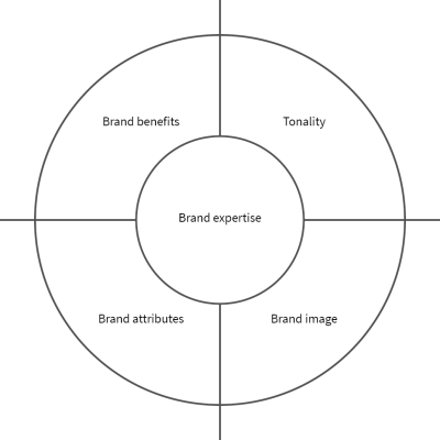
Precisely. This brings us to the performance part. Bring your brand to life based on the characteristics, values, and image objectives you defined, and – if you have a marketing slogan – based on the slogan that communicates the essence of your brand. 

Presentations are essential experiential touchpoints for your brand. They make it tangible, believable, exude its character and radiate its values. Both through its styling, its wording, in the narrative and via the people who present it. Together, they help the brand penetrate the market and exude the right feeling or character.

Brand expertise

Do a quick presentation brand check

PowerPoint isn’t just PowerPoint. It’s a vehicle for your brand management.

List your defined brand characteristics (for example: warmhearted, passionate, simple, quick, customer-oriented, unlike any other). Align all characteristics with the structure, composition, and key messages of your presentation. For example:

  • Customer-oriented… Does your title slide grab your recipients? How can your listeners relate to your presentation? How can they tell you’re talking specifically to them and no one else? How do you come across as customer-oriented? Or is your title slide still in the classic bureaucratic style, populated with title, date, name of the speaker or your company? Are you still thinking “I” or are you thinking “customer?”
  • Unlike any other … Is your presentation really that different to all the other presentations? Do you perhaps kick off with an unusual opening? Is your lateral thinking evident? What’s your unusual ending? Although “unusualness” is always relative to your brand’s attributes. What’s the significance of the brand attributes rooted in your corporate identity with regard to implementing and performing your presentation?
  • Do you have a claim or slogan? How does it run through the presentation? In allusions, wording and stories? How does it become tangible?
  • Have you trained everyone in the characteristics, image objectives and values that match what your presentation projects? Briefed the coach or trainer as to your brand image? Are the stories you want told clear and easy to repeat? To what extent are your speakers perceived as unusual, noticeably different, customer-oriented, or even human? How do you help them develop their performance so they come across that way?
  • Be honest: Is your presentation performance exciting? Does it make your audience smile at times? Are they nodding in agreement? Looking at you attentively?
  • How do you prepare for a presentation? What can you do afterwards to make the brand an experience?

This is only a tiny checkup. It would be, however, your routine check to ensure your talk or pitch is a lively performance on the presentation dancefloor. We often conduct checkups like this for our customers, but more thoroughly, and with positive results. Get in touch if you need a brand checkup, or simply a neutral perspective. Such feedback can be enlightening.

Most importantly: Simply be as unique as you are.

Contact us for a brand check.

Folienverwaltung

Corporate slide management in PowerPoint

Corporate slide management in PowerPoint - what really matters?

Reading time 5 minutes

No matter how big the organization, when it comes to using PowerPoint, there’s always a certain degree of chaos. You can’t find the slides you need, some sales staff are using the company presentation from two years ago, and everyone uses whatever images and icons they want. Even within one department it’s easy to lose track of which version of a slide is being used, and where.

Slide Management Notebook

Inefficient processes

As the saying goes, “too many cooks spoil the broth.” When a presentation is made or revised using input from several people, there’s usually only one way to ensure a good result: one person is in charge, and the others work through them. The person responsible incorporates all the material supplied by colleagues into a “master presentation” which only they may edit. Colleagues only receive copies for use or review. This is the best practice in companies that produce presentations to a high professional standard, such as management consulting firms or communication agencies.

Poorly archived slides and graphics

In most companies, everything you need for your next presentation is ready and available – but where? The company presentation and standard slides can usually be found on the intranet. Images for presentations are stored in an often unused and forgotten image database. Sales and marketing presentations are available on a shared network drive. Often, the stuff you need most can only be found if you ask the right people. The result of this chaos? If you can’t find what you’re looking for, you simply come up with your own solutions.

No update system

Once distributed, presentations quickly develop lives of their own. The widespread practice of “recycling” slides that are already saved somewhere on your hard drive makes it extremely hard to remove out-of-date slides from circulation and replace them with new ones. This creates a company-wide disparity of slides and presentations being used and shown, both internally and externally.

Find the right slide management software for PowerPoint

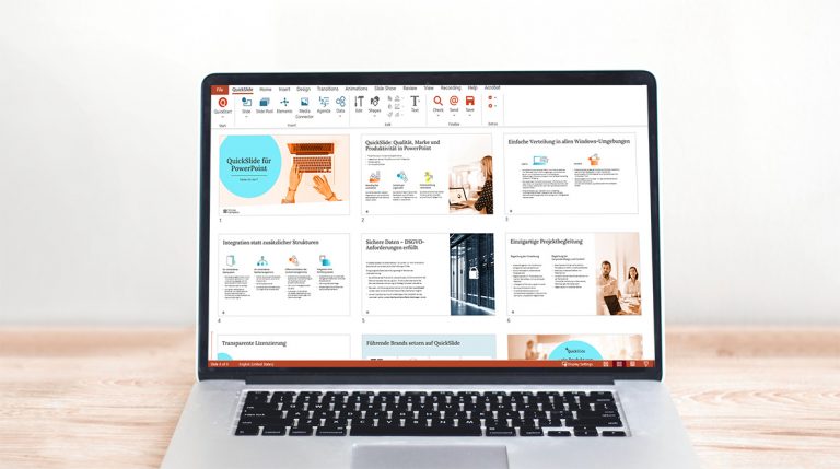
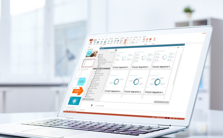
A slide manager for PowerPoint can help. There are many available, each with its own strengths and weaknesses. When choosing between them, it’s important to consider the criteria most relevant to your organization and your users. Different requirements demand different solutions.

Decision criteria when choosing software

Use this overview to help you choose the right solution. It explains the practical advantages and disadvantages of the various functionalities available.

Handling from a user perspective

delighted user

Presentation management software must be user friendly for it to be accepted by all colleagues. This includes:

  • Custom-made elements: The central purpose of a slide manager is to provide ready-to-use presentations and slides. But what about users who want to create their own slides? It’s extremely useful if they can also access a modular system of individual graphic elements in the corporate design – images, pictograms, formatted text elements, charts and icons.
  • Integration into PowerPoint: Slides, images and other content must be available in the application you’re working with, i.e., directly in PowerPoint. Whereas whole presentations or slides are inserted only occasionally while working on a presentation, slide content such as images, icons, formatted text elements and charts in your corporate design must always be at hand whenever you need them.
  • Simple, intuitive user interface: The more complicated the software appears to the user, the less likely they’ll use it.
  • Rapid slide retrieval: Particularly in companies with a large pool of available slides, it makes sense to give users various ways to find the content they’re looking for. Possibilities include an overview in the form of a folder structure, a visual search via a slide preview (ideally including individual slides within presentations), a keyword search and a full-text search.
  • Simple insertion of required content: Once you’ve found what you’re looking for you should be able to use it immediately for instance by double clicking on it. Typically, inserted slides acquire the design of the presentation being worked on. It may, however, be important to retain the original design of the inserted slide. For agencies or management consulting firms that frequently work with their clients’ designs, it’s also handy to paste just the graphics from the content area of the slide, rather than the whole slide, to use these graphics more easily in different designs.
  • Offline availability: Purely network-based solutions have the advantage that users always see the most up-to-date content. In practice, many key users travel a lot and have inadequate or no network access. It’s then vital to make the most important material available offline. This way, good slide management can also make a difference outside the office.
  • Multilingual interface: Although English is often the dominant business language, many users appreciate having a software interface in their own native language.
  • Personal area: A personal area in which each individual user can organize their frequently used personal slides and graphics is a practical additional feature.

Handling from an administrator perspective

Only a very small number of users are generally responsible for uploading and maintaining content. These individuals, referred to here as administrators, have additional user rights and requirements:

  • Simple addition and revision of slides and graphical elements: Although usability, especially finding and inserting content, is most relevant to the normal user, well thought-out software handling is also important for the administrator. It should be possible to add, replace, reorganize, rename, and delete content – and all without the help of the IT department. Otherwise, the level of maintenance required and resulting reaction times quickly become unreasonable.
  • Automatic updates of old slides: To prevent issues with slide “recycling,” an automatic update function should be available. This prompts the user to update a particular slide and should ideally provide a preview of the new slide. This function should work even if the user has already copied the slide into other presentations.
  • Enabling of user groups: Not all content is relevant to all users, and a lot of it should not be made generally available. A PowerPoint corporate slide manager should allow specific user groups to be set up and individually managed.
  • Delegation of roles: The slide manager should support best practice in the presentation production process. One person (i.e., one person per user group, plus their backup colleague) may upload, change or delete content, the other users may only use the content. In some cases, further differentiation of user roles might make sense. As far as PowerPoint is concerned, the above system has proved successful in nearly all cases.
  • Tracking user behavior: Setting legal concerns aside, it can be interesting to analyze user behavior. For users themselves, information on which slides are used most or are particularly well-rated by other people is practically worthless, as it doesn’t provide a meaningful basis for creating a presentation. But this information can be interesting for the administrator, as it can indicate where further slides (or graphics, etc.) could be made available.

Handling from an IT perspective

IT often gets the job of implementing and maintaining the corporate slide management software. Here, further criteria become relevant:

  • Simple setup: In most companies there are more than enough software tools, and IT departments are often wary of the additional hassle involved in rolling out and maintaining new software. It’s therefore important that a slide manager can be integrated smoothly into existing IT infrastructure and doesn’t require an additional server, for example. It should be possible to roll out the software with regular tools, such as Microsoft SCCM or Citrix, and it should require minimal technical support. This includes being able to integrate existing user groups from the Active Directory.
  • Security: Any new software is a potential security risk and creates a lot of work when it doesn’t run properly. The choice of software should therefore favor solutions with suitable certification (e.g., Windows compatibility test) that’s already in use in large organizations.
  • Handling large data volumes: Large amounts of data can quickly accumulate in a slide manager. It’s important that the software solution is stable and runs quickly and reliably even with high data volumes. It should also minimize memory requirements and network load.

Consider usability from all these perspectives to help inform your choice of corporate slide management software. Talk to us if you need more guidance or tips: Contact us.

PowerPoint costs

The PowerPoint cost check

The PowerPoint cost check

Reading time 2 minutes

How efficient is your company when it comes to PowerPoint?

Most companies don’t realize the true costs associated with PowerPoint. They’re often completely underestimated, just like other potential opportunities for efficiency and savings. Perform the “how are we doing” check. Answer a few questions and get an idea of where you currently stand.

PowerPoint Kosten Illustration

What about the quality of your presentations?

On the one hand, there are the “hard” costs:

Get an overview of the number of users working with PowerPoint throughout your entire company.

  • This includes external presentations – for management, marketing, sales, customer appointments, trade fairs and conferences
  • And internal presentations – for management, marketing and sales, in-house consulting, strategy, controlling, secretariats, back offices, IT, project proposals, project meetings, reporting, documentation, review meetings, decision proposals, info events, etc.

You can now perform a rough calculation to get a rough estimate:

  1. Number of actual PowerPoint users across the company (i.e. everyone who works with it frequently or occasionally)
    times by e.g. 10 presentations a year
    times by e.g. 4 hours per presentation
    times by e.g. 80 Euros per hour average internal rate
     
  2. Then calculate the costs incurred as a result of hiring agencies in various departments.
     
  3. If you are one of those companies with its own PowerPoint services department, factor in the full costs for this. Bear in mind that, while this results in less work for the users, most users tend to make adjustments, changes or even entire presentations themselves. As such, base your rough calculation on a smaller number of presentations per employee or less expense per presentation, depending on how your processes are structured.
     
  4. Assess your marketing department’s expenses associated with the following:
  • Providing the current master, slide template or topic-related templates, e.g. on your Intranet
  • Managing everything (adjusting design or company information, updating figures, facts, topics etc.)
  • Reminding users about old versions, data and facts, checking these or recalling them and sending new ones, and discussing the use of corporate design, incorrect wording etc. with heads of department and management

We still have to assess the soft factors:

  • Quality and efficiency of meetings, decision proposals and project communication
  • Acceptance and staff satisfaction during use
  • Consistency of brand communication (this is about more than just using colors, fonts and logos correctly!)

We actually have customers who have calculated this, and assessed it in terms of total number of slides. They were extremely surprised by the result. Click here to see an example of how even a small-scale action resulted in a six-figure saving.

As you see, it’s truly worthwhile to stop regarding things purely as an individual user, department or division, and instead elevate the entire matter to a managerial level. That’s precisely what we hope this article encourages you to do.

Weiße Zahlen auf weißem Hintergrund

Does my presentation need an agenda?

Does my presentation need an agenda?

Reading time 2 minutes

Yes. Yes. And yes. We have good reason to be bold. An agenda affects the whole dynamic of presenting. It helps you keep on track while presenting, and it grabs your audience’s attention from the outset.

Agenda

No orientation, no attention

That’s how humans are. No matter who they are, or what situation they’re in. They need certainty, orientation and information. They wonder, what am I getting myself into here? How long will it take? What’s it about? Who’s the person standing there, why are they allowed to tell me something, and why should I trust them? Is this going to be something I should even spend time on? In the back of their mind or deep in their gut, their subconscious is worrying about practical things: What happens if they need to go to the bathroom? Will there be something to drink? Will I make it on time for the next meeting? People need to be reassured and engaged. Consciously or subconsciously. And only then can they give you their full attention.

No respect, no attention

Your audience is full of people who are busy. Tasks, projects, deadlines, urgently needed clarifications – so many things fill their workdays. These people are giving you a set amount of time to hear your presentation. They want to feel they’re getting a good return on their investment. Make them feel that you understand and respect all these factors from the very beginning. Convey a good feeling that resonates with them there and then. Lay out your agenda using images, language, terminology, or corporate jargon to list objectives that connect with your audience’s hearts and minds.

No excitement, no attention

Another purpose of an agenda is to generate curiosity and anticipation. We’re not talking about standard headings such as

1. Introduction

2. Requirements

3. Situation analysis

4. Solution

5. Budget

6. Next steps

While an agenda like the one above isn’t wrong, it will create “boredom barriers” right from the start of your presentation. It’s hard to win back your audience’s interest from this point

Pulling the rabbit out of the hat

Two examples from a sales context that you can use as inspiration for your own agenda.

A customer presentation by a local software provider:

What’s in store for you today: 15 minutes of exciting insights into efficient management. Everything you need to:

  • Keep your IT management running smoothly
  • Keep IT assets even more secure
  • Optimize your processes
  • Keep budgets under control
  • Inspire colleagues and local citizens

A beauty company’s B2B presentation:

15 minutes that go more than skin-deep …

  • How to inspire your customers with holistic beauty products and services
  • Why trust is so important today when choosing your business partners
  • What research and innovation mean for your success
  • How quality makes you credible
  • How to attract and retain customers
  • How the principle of awareness sets you apart

Objective, target group, logical flow and structure are the basis of any agenda. Then you can start thinking about providing orientation, conveying respect, resonating with your audience, and offering exciting prospects. If you do all this, you’re on the right track to engaging, even inspiring, the people you’ll present to.

Pie-chart

Data display formats

An overview of the most important data display formats

Which charts are suitable for what purpose?

Reading 3 Minutes

Want to back your PowerPoint presentation up with data? There are many different ways of visualizing data. But before you choose a particular format, it is important to have worked out your data’s core statement. Only then can you systematically decide what is the most appropriate format. This list of the most common display formats will help you familiarize yourself and make your choice.

Column chart

The classic chart. Suitable for showing changes over time. This format is used in statistics to convey frequencies.

Column-chart

Bar chart

The bar chart is essentially a column chart at a different angle. The values are shown vertically, with the advantage being less restriction on the side labeling, providing more space for longer product names, for example. This format is used for rankings and comparisons.

Bar-chart

Additive charts (stacked columns or bars)

A special form of column or bar chart, which enables sub-quantities of total quantities to be shown, as well as the change in composition over time. One example is a chart showing the change in sales figures, incl. the percentage of specific products.

Stapeled-column-chart

Waterfall chart

Waterfall charts are a special form of column chart. An initial value is increased or decreased by subsequent values, with the last column showing the final value. This chart can be used to explain deviations from target figures or a change in sales revenue compared to the previous year.

Waterfall-chart

Curve or line chart

This is used to show time progressions and trends, particularly for large volumes of values. Superposed progressions make comparisons easy.

Line-chart

Area chart

This is a curve chart in which the space between two progressions are colored in. The 100% area chart is a special case that can be used to show, for example, the trend in the percentages of various products in a portfolio over time.

Area-chart

Pie chart, donut chart

This is designed to show percentages of a total value. Its strength lies in enabling rapid comprehension, particularly when not too many sub-quantities are shown. The items should be in clockwise order based on relevance, starting at 12 o‘clock.

Pie-chart

Radar or spider charts

This display format is used to show characteristics of various criteria. Each criterion has its own axis, with the zero point at the center. The combination of values creates different sized, easily comparable areas, or lines. It thus enables personal skill profiles to be conveyed visually.

Net-diagram