Strategy Compass Logo AddIns for Microsoft Office
Search
Close this search box.
Notebook with PowerPoint Master

How do you create a good presentation master?

What makes a good PowerPoint master?

Reading time 4 minutes

The world of presentations has come a long way in recent years. Thankfully, we are seeing fewer and fewer slides packed full of gray text boxes incongruous with the company’s branding.

This is because companies are placing more importance on templates. And they are also becoming more aware of the fact that PowerPoint can shape and define a company’s image.

PowerPoint Master, Entwurfsvorlage, Template

How do you create a good PowerPoint master?

The following criteria are crucial:

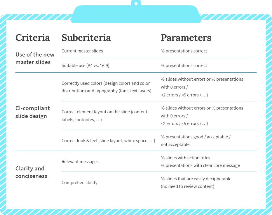
Content requirements: How do you create a master that meets the special requirements for information and communication?

Brand look & feel: How do you get the master to fit the corporate design?

Usability: How do you create a user-friendly PowerPoint master?

Technical quality: Have all the settings been stored cleanly and sensibly?

Content requirements

Be clear about basic use and technical issues:

  • Where do you primarily use presentations? Live presentations, remote presentations, presentations sent by email, printed as a handout?
  • This leads to the question of format: Will there also be other formats in addition to 16:9 (which 16:9?)?
  • In which language is the master to be created?
  • What types of presentations are created? At many companies, presentations as the means of choice for a wide variety of purposes: internal discussion slides, training documents, white papers, reference slides, quotes/offers and, of course, corporate-presentation slides.
    The range of layouts should be geared around these purposes, and provide design options for the most important uses.

Based on these considerations, you may find it a good idea for your company to have multiple masters for different purposes or formats or even in different languages.

PowerPoint Formate

Brand look & feel

Companies will generally have defined a corporate design that will have been developed for print and web advertising. Most will not have made PowerPoint applications a priority when creating the corporate design, yet the core elements of their image are also reflected in presentations. The specifications do, however, need to be adapted to the PowerPoint requirements. Sometimes compromises need to be made in order to achieve a practical solution for users.

If the company has special fonts of its own, it is worth weighing up the pros and cons of using these compared to the system’s existing fonts. The corporate design’s color scheme can usually be accurately reproduced in PowerPoint—as long as you bear a few technical particularities in mind. Special shapes featured in the corporate design, or the manner in which images and text are displayed, can usually also be recreated appropriately in the PowerPoint master.

Corporate Design in PowerPoint

Usability

As PowerPoint is used by many staff within a company, a PowerPoint master needs to be accepted by the majority of its users.

In general, it is possible to design content to a similar degree of accuracy and creativity in PowerPoint as can be achieved with a graphic-design program. When creating the master, however, it is important to remember that most PowerPoint users have no knowledge of graphic design, so it is advisable to make handling as simple as possible. If a master offers too many different layouts that are difficult to distinguish in the overview, some users will probably always end up using the same layout and duplicating slides.

Technical quality

Creating clean, consistent presentations requires aligning placeholders and other elements precisely in the layouts. PowerPoint also offers some settings that make it easier to work with the master: text layers, footers, pre-set shapes and tables should be defined esthetically and in a manner that fits the corporate design. It is particularly advisable to think about the settings beforehand if many users are going to be working with the master or if there are going to be multiple masters.

Ideally, the various user groups at the company will be involved in the development process. Strategy Compass recommends this approach, as all its past experiences with it have been positive.

Expanding the master

Team-Mitglieder

The PowerPoint master is initially just a design framework; the master itself has no content. Many staff members find this too abstract and undefined, which is why the following options are available:

Slide templates / Sample slides / Chart pool / Slide deck

There are many concepts when it comes to sample slides populated with general content. These templates can be adopted just as they are by the users, or may need only minor adjustments to content. In addition to pure text slides, these sorts of slide templates typically also include process slides, timelines, quotes, pros & cons slides, agendas, and management summaries, though business-administration or IT topics are often also created as templates. Good slide templates are tailored to the company’s corporate design, and are able to convey this just as effectively as a brochure or similar would.

Corporate-design overview in the PowerPoint style guide

To give users further design guidance, it is worth creating a PowerPoint style guide. This provides implementation ideas, and acts as a visual representation of the design the company seeks to achieve. Practical usage tips can also be added to the style guide.

The pro tools

Tools like QuickSlide integrate masters, sample slides, and style guides directly into PowerPoint, enhanced with the company’s own graphics, images, and icons. Many small assistants within the program make it easy to create slides consistent with corporate design, or to correct those deviating from it. Because a PowerPoint master alone won’t achieve professional presentations.

For more info, click here.

Ballon

Presentations and productivity

Room for improvement

Further increasing productivity with QuickSlide

Reading time 3 minutes
Ballon

Leveraging efficiency potential for the long term

Companies can save 40% of their time and resources when creating and editing presentations simply by using QuickSlide. And this figure can be further increased, because additional potential for efficiency can be generated by consolidating and regularly verifying QuickSlide use.

Improving means becoming more efficient

If you’ve been using QuickSlide for a while, it’s now time for the first review, which involves asking yourself the following questions:

  • Is QuickSlide used across the board?
  • How do users go about handling the master?
  • Is the slide pool adequate or are relevant slides missing?
  • Which applications constantly reveal discrepancies during the Corporate-Design Check?

The answers to these questions will shed important light on how QuickSlide can be adapted even better to the company’s needs. Often it is just small changes that end up having a big impact and making QuickSlide even more efficient to use. In general, whatever is done to improve presentation quality will also have an effect on productivity. Because less adjustment and coordination is needed, and correction cycles no longer apply. Considerably fewer resources overall are thus tied up in PowerPoint.

A helper and partner for more productivity

We don’t just help companies successfully implement QuickSlide; we provide assistance well beyond this stage too. We consider ourselves a partner for sustainably boosting efficiency and quality at companies. This is why we constantly further develop our products, and how they’re used by organizations. After all, it’s in both our interests and those of our customers that our software solutions offer impressive benefits on a daily basis and actually deliver the added value anticipated.

Meeting

Framework for QuickSlide usage

For an increasing number of companies, we’re setting up a standard governance process. Initially, this involves formulating the key project objectives. Once these are clear, success criteria and indicators can be defined. This process generates a high degree of acceptance and satisfaction, both among users and decision-makers.

Sample criteria and how to assess them

We worked with a major consultancy firm to develop the following criteria and indicators. We wanted to assess the impact QuickSlide had on one of the company’s main objectives: Ensuring a consistent corporate design across all presentations.

Criteria table

The example shows how specifically QuickSlide use can be assessed in terms of the pre-defined objectives. Objectives such as extent of use and quality of presentation content can similarly be verified. This gives companies the confidence of knowing they are doing the right thing, but also highlights the areas where action is still needed.

Reviewing, playing it safe, taking action

Half-yearly reviews are conducted with decision-makers from various divisions to assess the extent to which the defined objectives were achieved. In most cases, it soon becomes clear that QuickSlide makes the work easier overall and brings about noticeable improvements. But what about the very specific indicators? If, for instance, it has been found that the current master is not yet being used optimally, particularly in one division, swift action can be taken to address this. One example here might include webinars and user training aimed at the specific requirements of certain departments. The way in which slides from the slide pool are used highlights the areas where expansion or revision is required.

We’ve had very positive experiences with this approach and are seeing that companies who follow suit are able to maximize the efficiency potential offered by QuickSlide even more effectively and, most importantly, for the long term.

QuickSlide for PowerPoint

Let us work with you to devise a governance process, customized to your needs and objectives, and using specific criteria and indicators.
info@strategy-compass.com

Workshop, Besprechung

Next Level PowerPoint

Next-Level PowerPoint

Using a governance framework to ensure lasting success

Reading time 3 minutes

“We want to structure our presentations better and be more efficient.”

Words to this effect are among the most common preliminary enquiries we receive. Closely followed by the marketing challenge of seeking “consistent branding.” These lead-ins imply a growing awareness of problems, which is something that develops when organizations work frequently with presentations, both internally and externally. QuickSlide provides quick relief and noticeable improvements. But you can further maximize quality and costsavings by embedding this aspect into the right structures, responsibilities and processes. Through our consulting, what may sound a little abstract to some customers at first ends up being a clear checklist that yields amazing results with very little fine-tuning.

Workshop, Besprechung

Read a specific case study involving a large consultancy firm, and see how a standard was established within the space of a year.

1.

An initial step saw us work together to identify the core targets. One of these was to implement the corporate identity consistently (in all its facets, well beyond just the corporate design).

To measure target achievement, the Marketing department took charge of introducing the “CI Check” governance element, which includes having internal and, in some cases, external experts check the presentations provided in QuickSlide, as well as important pitch documents.

2.

The next step revolved around establishing a steering committee with decisionmakers from multiple company divisions. The decision to introduce a governance framework at the or-ganization involved defining the various steps and milestones for the following 12 months.

The steering committee approved the criteria and parameters for half-yearly reviews. To give you a better idea, here are a few examples of how such criteria can be defined:

Criteria table

3.

The results regarding target achievement, training requirements, potential for further standardization, or further content development are presented at the subsequent review meetings. The decisionmakers gain valuable insights into the status of their organization, and are able to approve measures with great accuracy.

4.

Once established, targets, measures and parameters continue to be monitored, with the steering committee’s activities coordinated by the department in charge reduced to one annual review.

Präsentationsbearbeitung am Notebook

The above steps taken for CI consistency are the same as for the targets concerning the quality of presentation content and the usability of QuickSlide. This results in a standard that truly helps all departments, and which maximizes the precise potential that had originally be set as a project target, creating a high level of acceptance and satisfaction among users and decisionmakers alike. It’s not rocket science. But it will get you a high ROI. What is needed is an awareness of the issue’s relevance, and a certain degree of consistency. To ensure you’re not left to your own devices when it comes to developing and implementing your governance framework, Strategy Compass is on hand to contribute its expertise and years of experience, and works with you to devise an approach tailored specifically to the needs and features of your organization.