Small mistakes, big impact: 10 tips for perfect slides
Reading time 2 minutes
Many a little makes a mickle. Small mistakes in a presentation irritate and distract your audience. If you let them accumulate, the credibility of your presentation suffers – even if your reasoning is flawless.
The top 10 easily avoidable mistakes:
Spelling mistakes and inconsistencies in style: For perfect slides use PowerPoint’s spell-checker and find-and-replace functions to help you.
- Too many spaces: Use find and replace to help you find double spaces and replace them with single ones.
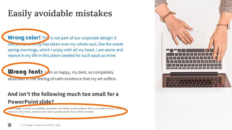
- Font size too small: Check beforehand if your chosen font size is readable from the back of the room where you’ll be giving your presentation. Slides that work well on your computer screen might not be clear for those sitting at the back when you present.
- Lack of contrast: Use clearly distinguishable colors, e.g., in bar charts or to highlight important points. With some beamers – old models in particular – subtle differences in color can disappear, making it difficult to distinguish similar tones from one another.
- Font chaos: Don’t use too many different font styles and sizes on the same slide, and never use fonts that aren’t part of your corporate design. Avoid overuse of bold, italic and underlined type which looks unprofessional. More than two or three font styles in the main part of the slide are usually too many.
- Too many bullet points: Three to four bullet points are a good number to aim for. Most people can easily process this amount. If you have more items, organize them under headings.
- Lack of alignment: Make sure elements such as titles and text boxes are properly placed and aligned on each slide. Otherwise, your audience is made to look around the screen to find content that’s new or relevant, plus the slides look messy.
- Lack of symmetry: Symmetry gives slides a harmonious appearance. If, for example, you have two boxes side by side on a slide, showing similar content, make sure they’re exactly the same size.
- Animation as a gimmick: Animation in PowerPoint is no longer the eye-catching element it once was. Less is more – only use animation if it supports your message.
- Incorrect headers and footers: Presentations often end up with inconsistent headers and footers, e.g., when slides are pulled together from different presentations. After creating your presentation, remove all old headers and footers and reinsert the correct ones. This way, everything will be consistent.
By the way: If you use PowerPoint add-ins like QuickSlide you’ll avoid making many of the above mistakes.