Strategy Compass Logo AddIns for Microsoft Office
Search
Close this search box.
PowerPoint costs

The PowerPoint cost check

The PowerPoint cost check

Reading time 2 minutes

How efficient is your company when it comes to PowerPoint?

Most companies don’t realize the true costs associated with PowerPoint. They’re often completely underestimated, just like other potential opportunities for efficiency and savings. Perform the “how are we doing” check. Answer a few questions and get an idea of where you currently stand.

PowerPoint Kosten Illustration

What about the quality of your presentations?

On the one hand, there are the “hard” costs:

Get an overview of the number of users working with PowerPoint throughout your entire company.

  • This includes external presentations – for management, marketing, sales, customer appointments, trade fairs and conferences
  • And internal presentations – for management, marketing and sales, in-house consulting, strategy, controlling, secretariats, back offices, IT, project proposals, project meetings, reporting, documentation, review meetings, decision proposals, info events, etc.

You can now perform a rough calculation to get a rough estimate:

  1. Number of actual PowerPoint users across the company (i.e. everyone who works with it frequently or occasionally)
    times by e.g. 10 presentations a year
    times by e.g. 4 hours per presentation
    times by e.g. 80 Euros per hour average internal rate
     
  2. Then calculate the costs incurred as a result of hiring agencies in various departments.
     
  3. If you are one of those companies with its own PowerPoint services department, factor in the full costs for this. Bear in mind that, while this results in less work for the users, most users tend to make adjustments, changes or even entire presentations themselves. As such, base your rough calculation on a smaller number of presentations per employee or less expense per presentation, depending on how your processes are structured.
     
  4. Assess your marketing department’s expenses associated with the following:
  • Providing the current master, slide template or topic-related templates, e.g. on your Intranet
  • Managing everything (adjusting design or company information, updating figures, facts, topics etc.)
  • Reminding users about old versions, data and facts, checking these or recalling them and sending new ones, and discussing the use of corporate design, incorrect wording etc. with heads of department and management

We still have to assess the soft factors:

  • Quality and efficiency of meetings, decision proposals and project communication
  • Acceptance and staff satisfaction during use
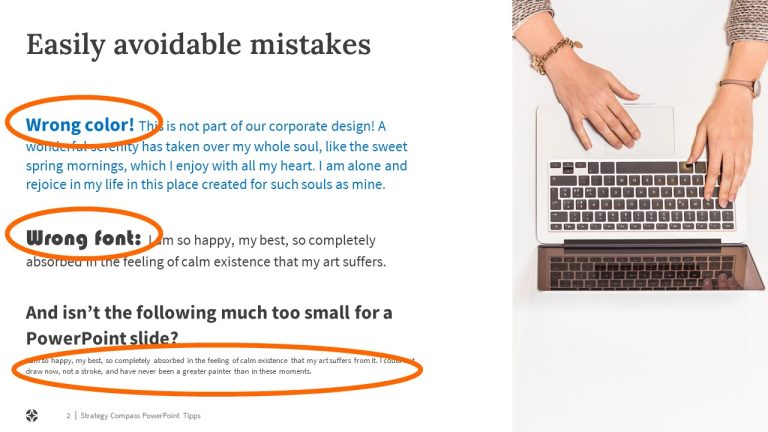
  • Consistency of brand communication (this is about more than just using colors, fonts and logos correctly!)

We actually have customers who have calculated this, and assessed it in terms of total number of slides. They were extremely surprised by the result. Click here to see an example of how even a small-scale action resulted in a six-figure saving.

As you see, it’s truly worthwhile to stop regarding things purely as an individual user, department or division, and instead elevate the entire matter to a managerial level. That’s precisely what we hope this article encourages you to do.

Weiße Zahlen auf weißem Hintergrund

Does my presentation need an agenda?

Does my presentation need an agenda?

Reading time 2 minutes

Yes. Yes. And yes. We have good reason to be bold. An agenda affects the whole dynamic of presenting. It helps you keep on track while presenting, and it grabs your audience’s attention from the outset.

Agenda

No orientation, no attention

That’s how humans are. No matter who they are, or what situation they’re in. They need certainty, orientation and information. They wonder, what am I getting myself into here? How long will it take? What’s it about? Who’s the person standing there, why are they allowed to tell me something, and why should I trust them? Is this going to be something I should even spend time on? In the back of their mind or deep in their gut, their subconscious is worrying about practical things: What happens if they need to go to the bathroom? Will there be something to drink? Will I make it on time for the next meeting? People need to be reassured and engaged. Consciously or subconsciously. And only then can they give you their full attention.

No respect, no attention

Your audience is full of people who are busy. Tasks, projects, deadlines, urgently needed clarifications – so many things fill their workdays. These people are giving you a set amount of time to hear your presentation. They want to feel they’re getting a good return on their investment. Make them feel that you understand and respect all these factors from the very beginning. Convey a good feeling that resonates with them there and then. Lay out your agenda using images, language, terminology, or corporate jargon to list objectives that connect with your audience’s hearts and minds.

No excitement, no attention

Another purpose of an agenda is to generate curiosity and anticipation. We’re not talking about standard headings such as

1. Introduction

2. Requirements

3. Situation analysis

4. Solution

5. Budget

6. Next steps

While an agenda like the one above isn’t wrong, it will create “boredom barriers” right from the start of your presentation. It’s hard to win back your audience’s interest from this point

Pulling the rabbit out of the hat

Two examples from a sales context that you can use as inspiration for your own agenda.

A customer presentation by a local software provider:

What’s in store for you today: 15 minutes of exciting insights into efficient management. Everything you need to:

  • Keep your IT management running smoothly
  • Keep IT assets even more secure
  • Optimize your processes
  • Keep budgets under control
  • Inspire colleagues and local citizens

A beauty company’s B2B presentation:

15 minutes that go more than skin-deep …

  • How to inspire your customers with holistic beauty products and services
  • Why trust is so important today when choosing your business partners
  • What research and innovation mean for your success
  • How quality makes you credible
  • How to attract and retain customers
  • How the principle of awareness sets you apart

Objective, target group, logical flow and structure are the basis of any agenda. Then you can start thinking about providing orientation, conveying respect, resonating with your audience, and offering exciting prospects. If you do all this, you’re on the right track to engaging, even inspiring, the people you’ll present to.

Pie-chart

Data display formats

An overview of the most important data display formats

Which charts are suitable for what purpose?

Reading 3 Minutes

Want to back your PowerPoint presentation up with data? There are many different ways of visualizing data. But before you choose a particular format, it is important to have worked out your data’s core statement. Only then can you systematically decide what is the most appropriate format. This list of the most common display formats will help you familiarize yourself and make your choice.

Column chart

The classic chart. Suitable for showing changes over time. This format is used in statistics to convey frequencies.

Column-chart

Bar chart

The bar chart is essentially a column chart at a different angle. The values are shown vertically, with the advantage being less restriction on the side labeling, providing more space for longer product names, for example. This format is used for rankings and comparisons.

Bar-chart

Additive charts (stacked columns or bars)

A special form of column or bar chart, which enables sub-quantities of total quantities to be shown, as well as the change in composition over time. One example is a chart showing the change in sales figures, incl. the percentage of specific products.

Stapeled-column-chart

Waterfall chart

Waterfall charts are a special form of column chart. An initial value is increased or decreased by subsequent values, with the last column showing the final value. This chart can be used to explain deviations from target figures or a change in sales revenue compared to the previous year.

Waterfall-chart

Curve or line chart

This is used to show time progressions and trends, particularly for large volumes of values. Superposed progressions make comparisons easy.

Line-chart

Area chart

This is a curve chart in which the space between two progressions are colored in. The 100% area chart is a special case that can be used to show, for example, the trend in the percentages of various products in a portfolio over time.

Area-chart

Pie chart, donut chart

This is designed to show percentages of a total value. Its strength lies in enabling rapid comprehension, particularly when not too many sub-quantities are shown. The items should be in clockwise order based on relevance, starting at 12 o‘clock.

Pie-chart

Radar or spider charts

This display format is used to show characteristics of various criteria. Each criterion has its own axis, with the zero point at the center. The combination of values creates different sized, easily comparable areas, or lines. It thus enables personal skill profiles to be conveyed visually.

Net-diagram
Pfeile nach rechts zeigend

The golden thread – Create well-structured presentations

The golden thread

How a well-structured presentation helps you hold your audience

Reading time 2 minutes

You want to give a good presentation that holds your audience’s attention right to the end? One that creates enthusiasm for your topic? And for you as the speaker? Your presentation concept is the key. Based on your target group, aims and central message, and taking into account the time available, you need to create a clear structure with a golden thread running through it.
This structure and its golden thread help your audience to keep up with you, to understand your message and to concentrate over a longer period of time. Your audience stays with you. And what can be better than that?

What do we mean by "concept" and "golden thread"?

There are many ways to create a well-structured presentation. The most tried-and-tested method sounds simple, but works extremely well.
First, ask yourself the following questions:

  • What do I want to achieve with my presentation, what’s my aim?
  • Who’s my audience? When would they consider a presentation to have been really worthwhile?
  • What’s my core message?

Then structure your presentation into the three typical sections:

Wirkung

Introduction, main part, conclusion.

Each section has a particular purpose.

Introduction – You get your audience’s attention. You provide orientation and bring everyone up to speed. You present your central question. The answer to this question will be the golden thread running through your presentation. A good introduction brings everyone together, makes them curious, and prepares you for the main part of your presentation.

Main part – now you must convince your audience about your core message. Structure your statements and arguments into logical sections. Remember that your audience is hearing and seeing your presentation for the first time. Give them time. Refer to different aspects one at a time. Use metaphors and imagery from your audience’s areas of interest, concerns or expertise. Try using a pyramid structure for this part of your presentation.

Structure of presentations

The central message is at the top of the pyramid and is supported by appropriate arguments and facts. The decision-maker hears the most important point first, followed by the main arguments, and then the relevant details. This allows them to assimilate and follow your arguments. This structure has another advantage: if you start running out of time, it gives you the flexibility to skip details without losing your thread and your central message.

Conclusion – This is crucial for anchoring your message in your audience’s mind. Summarize everything. Then make concrete proposals for how to proceed. Perhaps even mention the next steps. Don’t be tempted to include a “thank you for listening” slide – you’ll bore your audience and lose them at the last moment. Your very last slide should round off the presentation and show the way forward!

Presentation creation in Corporate Design

Creating presentations in your corporate design

A unified look

Creating presentations in your corporate design

Reading time 3 minutes

You know the feeling? You’re sitting in a meeting and the presentation is good as far as its content goes, but it’s somehow not very convincing. There’s usually a very simple reason for this: individual elements of the presentation don’t match, each slide looks different, and some slides have obviously been recycled from other presentations. In short: the presentation doesn’t have a unified look.

Isn’t it a bit superficial to judge a book by its cover? Whatever you might think, it has been shown that we do exactly this – and have been doing it for thousands of years. The human brain intuitively relies on form and “packaging” to navigate through the information jungle more easily. Imagine you find a perfectly good product on the supermarket shelf, but the packaging looks tatty. Would you buy it?

The same applies to presentations. A unified look comes across as professional and credible. To achieve this, you need to consider four important points:

1. Arranging the elements

Make sure each slide is based on the same layout grid: The title and content are always in the same place, as are footers, sources, and comments such as “confidential” or “backup.” Otherwise, when you change from one slide to the next, the various elements appear to jump around. This is very easy to achieve and the consistent use of layouts and placeholders can work wonders.

PowerPoint Raster

2. Fonts and colors

Make sure you always use your organization’s font and don’t apply too many different font styles (bold, italic, underlined). Highlighting points is OK, as long as it fits with the corporate design.

Designfarben in PowerPoint Fenster

Some PowerPoint add-ins have powerful Corporate Design Check functions which automatically check and correct any formatting that does not match your corporate design.

3. Imagery

Images can convey your messages very effectively but should also reflect your corporate identity. Your corporate design manual or brand guidelines will tell you how to use images, including which style to choose (e.g., clear and minimal, or lively and colorful) and how to use them (e.g., to depict a broad perspective or detail).

Find out if your company has a central image database you can choose from or if there’s a marketing budget for buying photos. Otherwise, you can find free images on established online databases, such as Unsplash or Pixabay. Make sure you obtain an appropriate license, credit photo sources and always keep your corporate design in mind for your selections.

4. Slide transitions and animations

The age of dramatic slide transitions and rotating elements flying into view is over. Consistent, understated slide transitions make a good general impression and don’t distract your audience from the content. Animations can be helpful for explaining complex ideas or situations step by step, but should never be used as mere gimmicks.


One very helpful tool can help you with all of this: QuickSlide for PowerPoint automatically adapts even older presentations to comply with your corporate design.

Kundennutzen Strategy Compass

Your audience in focus: Self-presentation versus client benefit

Focus on your audience

Self-presentation versus client benefit

Reading time 2 minutes

Imagine the following scenario. You’re a company decision-maker, and a potential business partner wants to make a pitch. He appears competent and friendly, and you invite him for an initial meeting. He arrives on time, and you settle down in the meeting room. And then it happens.

This pleasant, smartly dressed gentleman starts telling you the entire history of the family firm in detail since it was founded in 1923. Fast forward 20 minutes. You stare at the screen. Next topic: company mission and values. You’ve not yet exchanged a single word with each other. And your next appointment is in 10 minutes. Are you going to appoint this supplier? Probably not. And with good reason.

Unternehmensvorstellung

The potential business partner did his best but ignored some fundamental rules for successful company presentations. Or maybe he just wasn’t aware of them. The rule here is about taking your audience’s perspective – putting yourself in your listener’s situation, as in the example above. The only thing that really interests your potential client is what your firm can do for his. This information can’t be found in excessive self-presentation and purple-prosed hymns of praise for your company.

How can you make your company presentation more “helpful?” By observing four simple rules:

1. Viewpoint of your client

Establish a relationship with the client and put yourself in their shoes.

  • Which product or service is the right one for them?
  • What are the advantages to the client of appointing you?
  • How much time do they have? 

Be brief and to the point. Up to three advantages are enough. 

2. Your client's target group

  • Who does your potential client work for?
  • Who are their customers?
  • Which services could benefit these customers? 

3. Enter into dialogue

Refer to a real situation that’s currently affecting your potential client. Don’t just talk about what you can do – show them by engaging with them in a dialogue. Perhaps you can help directly with a current problem, and make yourself immediately indispensable. 

4. Client benefits come first

Structure your presentation according to relevance. Advantages and client benefits come first, then methods and working procedures. Keep self-presentation to a minimum.

Your company presentation will always vary a little depending on the client, the occasion, importance, and the target group. Instead of using a one-size-fits-all standard presentation, this calls for a modular approach with flexible elements.

Get more tips on giving presentations in our Insights section.

Label "Mistake"

10 tips for perfect PowerPoint slides

Small mistakes, big impact: 10 tips for perfect slides

Reading time 2 minutes

Many a little makes a mickle. Small mistakes in a presentation irritate and distract your audience. If you let them accumulate, the credibility of your presentation suffers – even if your reasoning is flawless.

Avoidable mistakes

The top 10 easily avoidable mistakes:

Spelling mistakes and inconsistencies in style: For perfect slides use PowerPoint’s spell-checker and find-and-replace functions to help you.

  • Too many spaces: Use find and replace to help you find double spaces and replace them with single ones.
  • Font size too small: Check beforehand if your chosen font size is readable from the back of the room where you’ll be giving your presentation. Slides that work well on your computer screen might not be clear for those sitting at the back when you present.
  • Lack of contrast: Use clearly distinguishable colors, e.g., in bar charts or to highlight important points. With some beamers – old models in particular – subtle differences in color can disappear, making it difficult to distinguish similar tones from one another.
  • Font chaos: Don’t use too many different font styles and sizes on the same slide, and never use fonts that aren’t part of your corporate design. Avoid overuse of bold, italic and underlined type which looks unprofessional. More than two or three font styles in the main part of the slide are usually too many.
  • Too many bullet points: Three to four bullet points are a good number to aim for. Most people can easily process this amount. If you have more items, organize them under headings.
  • Lack of alignment: Make sure elements such as titles and text boxes are properly placed and aligned on each slide. Otherwise, your audience is made to look around the screen to find content that’s new or relevant, plus the slides look messy.
  • Lack of symmetry: Symmetry gives slides a harmonious appearance. If, for example, you have two boxes side by side on a slide, showing similar content, make sure they’re exactly the same size.
  • Animation as a gimmick: Animation in PowerPoint is no longer the eye-catching element it once was. Less is more – only use animation if it supports your message.
  • Incorrect headers and footers: Presentations often end up with inconsistent headers and footers, e.g., when slides are pulled together from different presentations. After creating your presentation, remove all old headers and footers and reinsert the correct ones. This way, everything will be consistent.

By the way: If you use PowerPoint add-ins like QuickSlide you’ll avoid making many of the above mistakes.

Hände auf Laptoptastatur

Professional PowerPoint usage

Professional PowerPoint usage:

Master your masters, layouts and slides

Reading time 4 minutes

PowerPoint presentations are the standard for business communications, both internal and external. But PowerPoint is often used sloppily, even in the world’s leading companies. Tens of thousands of employees don’t use the software properly, creating loads of additional work, which costs time – and money. Besides this, many presentations aren’t even slightly aligned with the company’s corporate design guidelines, either. 

But here’s the thing: using PowerPoint correctly within your company is not that difficult at all. Here we explain how to structure a professional PowerPoint master, and what to look out for when using it. 

The slide master

This forms the basis of every PowerPoint slide, and lays down the basic elements of corporate design, for instance 

  • the slide layout – margins, position of headline, subhead, body text and footer 
  • design elements, such as logos or colored bars and lines 
  • the company colors and fonts 
  • text style – text levels, font sizes, bullet point styles, line and paragraph spacing
PowerPoint master Icon orange Strategy Compass

Layouts

Whereas the basic elements of corporate design are created in the slide master, layouts show the places on the slide where text, charts or tables are to be insertedwith the help of placeholders. 
 
In PowerPoint, go to the View menu and select the Slide Master” view. The slide master is shown at the top. Underneath you’ll see the various layouts, for instance, for title slides, section slides or slides with whole-page content (for text, charts, tables, etc.). These layouts should include all the standard slide types in the company. 
 
In the Start menu, click the lower half of the New Slide button to choose from the available layouts. Selecting one of these opens a new slide based on that particular layoutwhere you can then insert your content. 

Templates and presentations

PowerPoint masters and layouts are saved to a file with the extension .potx. The current version of the PowerPoint template should be made available to all employees. If you double click on this .potx file in File Explorer, a new presentation is opened (with the file extension .pptx), which you can start working with straight away. The template itself remains unchanged. 

PowerPoint: Template, Layouts, Slides

Practical tips for marketing and communications professionals

When a new or changed corporate design is implemented, sooner or later your PowerPoint master will have to be revised. While branding agencies generally know a great deal about corporate design, they usually lack expertise in PowerPoint.  
 
This is where specialists like Strategy Compass can help. We create your PowerPoint master, while implementing your design concept within PowerPoint. It doesn’t cost much and saves thousands of users a lot of effort. 
 
Most employees who use PowerPoint don’t have much experience in design. They haven’t the time to learn detailed style guides and often find them difficult to implement. When creating a PowerPoint master, find a workable compromise between adhering to the corporate design and its practical application. If the design specifications are difficult to implement within PowerPoint, theyll simply be ignored. It makes sense to make the PowerPoint master as user friendly as possible, and to provide key slides and ready-to-use elements (e.g. charts, icons and images) already featuring the corporate design. 

Practical tips for PowerPoint users

Using PowerPoint correctly makes producing your own presentations much easier. It also pays off when slides from several colleagues are compiled into one presentation. If everyone uses PowerPoint correctly, many of the typical revisions can be avoided. 

  • Always use the current master. Preferably the .potx file that you use to create a new presentation. This prevents mistakes being duplicated. 
  • Use the correct layouts. With layouts, you don’t have to think about where your content should be positioned on the slide. Furthermore, the placeholders already contain the correct formatting – especially for text. If a placeholder gets moved, you can easily get it back to its correct position using the “Reset” function in the “Start” menu. 
  • When you insert text into the placeholder, it will be formatted automatically in line with the corporate design. Each text level has a prescribed format. You can change the text level using the functions “Increase List Level” and “Decrease List Level” in the “Start” menu. Note: Don’t use the “Bullets” function, as this ignores the predefined text formatting that’s laid down in the master. 
  • Often slides from old presentations are needed as part of a new presentation. You or your colleagues might have created those slides using an old template. If you want to use slides from presentations which are so outdated, it’s usually best to redo them. Otherwise, you risk errors cropping up in your presentation without you even noticing. Create a new slide based on the relevant layout and copy and paste the individual elements from the old slide into the new slide (don’t copy the entire slide). You can paste charts or images into the relevant placeholders to position them correctly. Text is best pasted into the relevant placeholder using the option “Keep Text Only,” with the correct text level selected as described above. 
     

If you need help with creating a new PowerPoint master, or want to check an existing master, just get in touch with us. We’re professionals and experts, both in design and technical know-how, and can advise you on how to get the most out of PowerPoint to increase efficiency in your company. 


Sprechblase

Action titles: Provide orientation with clear slide headings

Action titles: provide orientation with clear slide headings

Reading time 3 minutes
Heard of Nicolas Boileau? This 17th century French author once made an observation that provides the key to a good PowerPoint slide title: “what is conceived well is clearly said.” Well-phrased titles attune your audience to the content and purpose of each slide. It helps them to navigate your slides quickly, so keeps them focused on your presentation. Added bonus: when you’ve finished writing your slide headings you’ll be much clearer on what you want to say.
Nicolas Boileau

Get to the point

This sort of slide title is called an “action title.” Sounds like a stage direction in a Hollywood blockbuster, but there’s an intelligent thought behind the name. With an action title, you’re sending out your message right at the top of the slide. It provides a concise summary of the slide’s main statement in one sentence. If you want to, you can still add a subheading that describes the slide’s exact content. For example:
Action title: Our sales rose 7% last year.
Subheading: Sales trend in million USD

Now read all your slides’ action titles one after the other. There’s your storyline – your presentation’s “golden thread.” (Compare this with using the slide subject or even the chapter heading as the title, and then flip through the presentation. Your audience would just give you blank looks!)

and … action!

A good action title is understood immediately. It summarizes your slide’s contents and gives you and your audience security by providing a clear message. It’s no longer than two lines, avoids “filler” words and provides facts, not PR. If you get too promotional, there’s a danger you’ll lose your audience or, worse still, your credibility.

A few writing style tips:
Use the active, not passive, voice.
Passive: The structure of the holding company is determined by the shareholders.
Active: The shareholders determine the structure of the holding company.

Use simple expressions, not complex formulations.
Complex: Through cost reduction, an earnings improvement potential of 9 million USD can be generated.
Simple: Cost reduction leads to an improvement in earnings of 9 million USD.

Keep it concise – avoid unnecessary words.
Too wordy: The analysis conducted shows that significant cost reductions can be achieved.
Concise: Analysis shows that costs can be reduced significantly.

Develop your own style

Do you pride yourself on your journalistic prose? Perhaps you favor a more telegram style? Or do you prefer to play it safe with carefully worded messages? This all depends a bit on your personality and presentation style, as well as the physical space available on your company’s PowerPoint master. If you’re most comfortable with a journalistic style, you can stir your audience’s curiosity and add some drama to your presentation with a title like, “The long road to Japan.” Or set the scene with a succinct telegram style: “Long-term thinking among foreign car manufacturers in Japan.” Or write in complete sentences, to avoid any misinterpretation: “Foreign car manufacturers in Japan start thinking long term.” Once you’ve decided on a style, you should stick to it throughout your presentation.

Strategy Compass regularly provides you with useful information and helpful tips about PowerPoint.

With QuickSlide, our PowerPoint add-in, we offer you a comprehensive solution for efficient, brand-compliant PowerPoint use at your company.

Get to know QuickSlide

Your own brand of presentation

Have the courage to make clear statements, and you’ll make a better impression. People will realize you want to achieve something and give them real added value. Action titles help you to organize your own ideas and make it easier for your audience to follow your thoughts and intentions. Present the facts up front, and you’ll lead your audience in your chosen direction – definitely the right course of action!