How much can you squeeze onto a slide? You’ve collated so much information and material, that it’s difficult to decide. In the process, you can easily overlook the fact that it’s not about cramming as much information onto the slide as possible, but about making a clear statement. An audience generally needs less rather than more information to grasp the point you’re making. Though it may be hard, cut out everything that’s not completely necessary to understanding the message. This may include surplus graphical elements as well as surplus text.
Using the presentation of a regional bicycle retailer as an example, here we show some typical elements that cause needless background noise on slides:

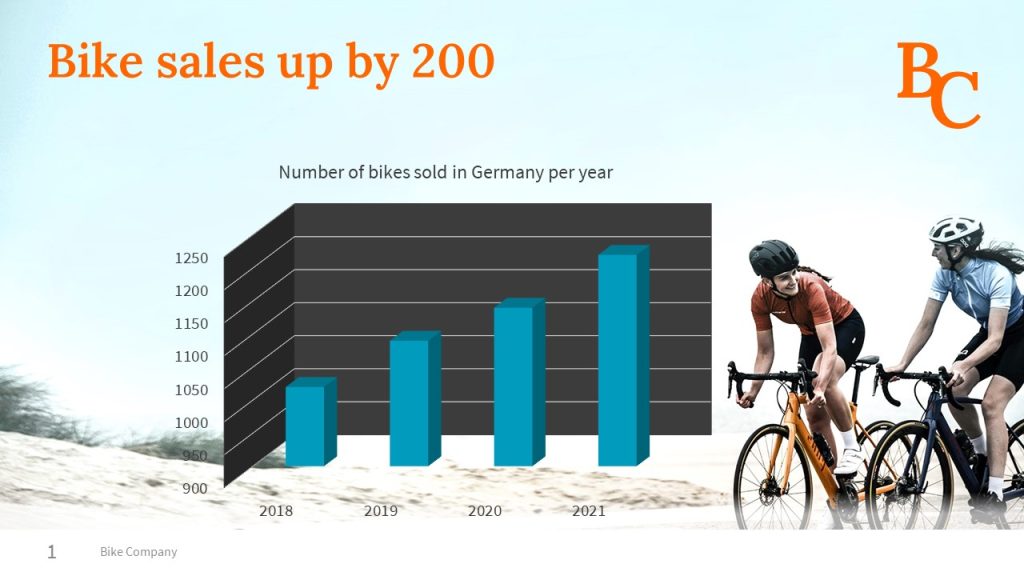
There is a lot of information on this slide, and not all of it is relevant to the message. Some of it is just distracting and reduces the persuasive power of the slide:
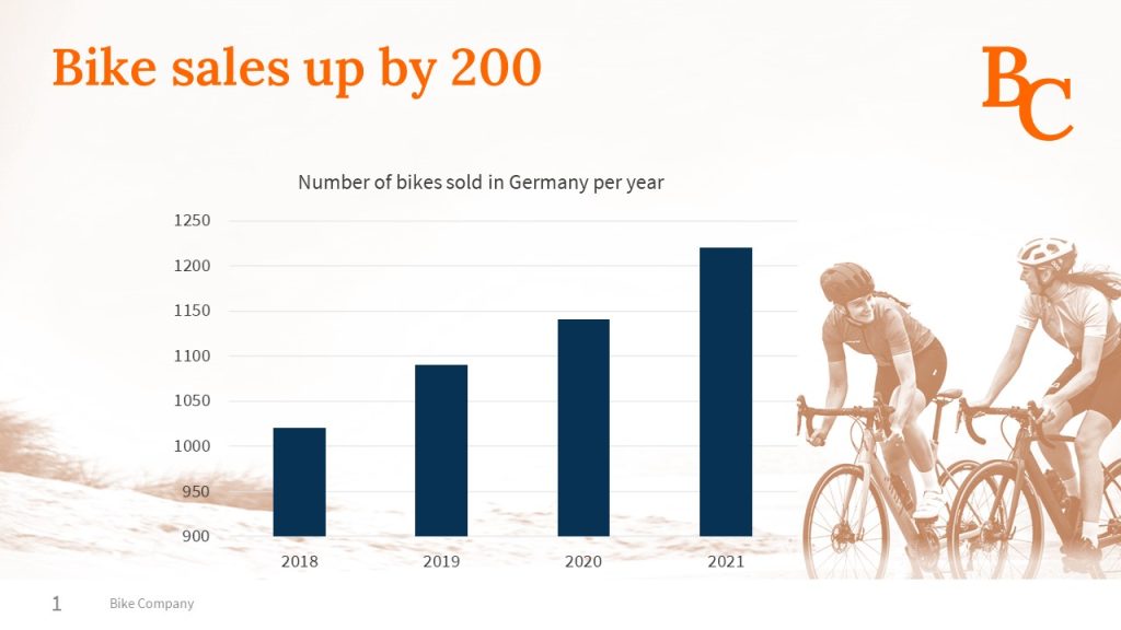
The bicycle in the background: It’s clear from the context and the title that the slide is about bicycles. An image of a bike provides no new information. Plus, the positioning and colors used make the chart difficult to read.

3D effect: The 3D effect reduces readability, making it very difficult to see the exact height of the columns. Besides this, the 3D effect is technically pointless, as the third axis is meaningless with data of this type.


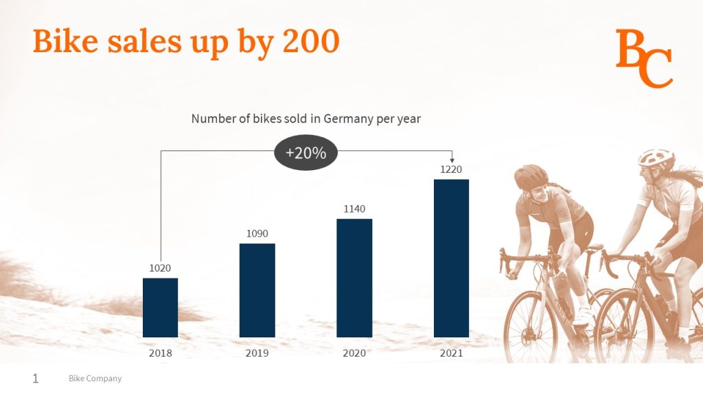
Marking the 20% increase underlines the actual message regarding increased sales.
By deliberately removing all elements that are not essential to your message, you can create an understandable and convincing slide. Review your own slides critically for any background noise. Can you find ways of reducing it?