A unified look
Creating presentations in your corporate design
You know the feeling? You’re sitting in a meeting and the presentation is good as far as its content goes, but it’s somehow not very convincing. There’s usually a very simple reason for this: individual elements of the presentation don’t match, each slide looks different, and some slides have obviously been recycled from other presentations. In short: the presentation doesn’t have a unified look.
Isn’t it a bit superficial to judge a book by its cover? Whatever you might think, it has been shown that we do exactly this – and have been doing it for thousands of years. The human brain intuitively relies on form and “packaging” to navigate through the information jungle more easily. Imagine you find a perfectly good product on the supermarket shelf, but the packaging looks tatty. Would you buy it?
The same applies to presentations. A unified look comes across as professional and credible. To achieve this, you need to consider four important points:
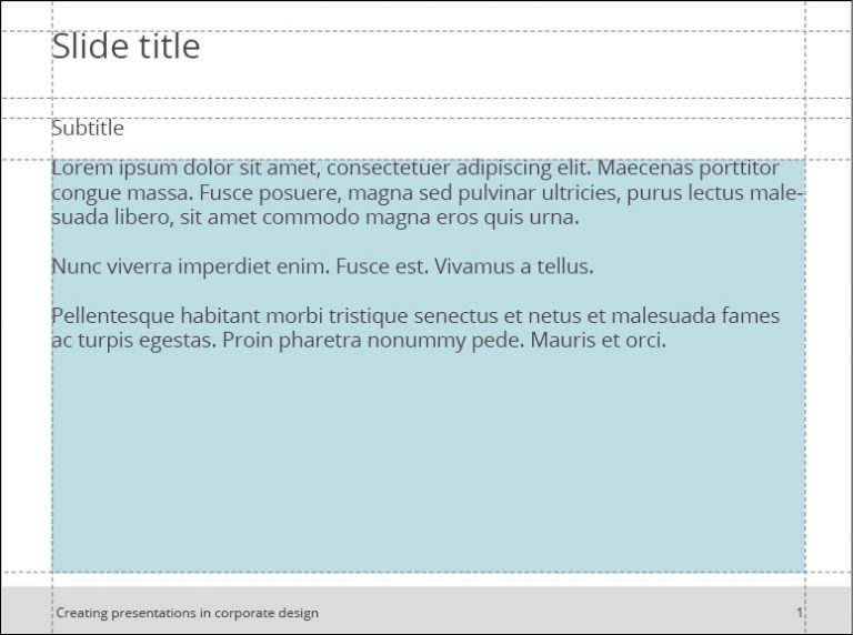
1. Arranging the elements
Make sure each slide is based on the same layout grid: The title and content are always in the same place, as are footers, sources, and comments such as “confidential” or “backup.” Otherwise, when you change from one slide to the next, the various elements appear to jump around. This is very easy to achieve and the consistent use of layouts and placeholders can work wonders.
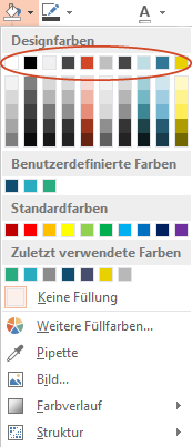
2. Fonts and colors
Make sure you always use your organization’s font and don’t apply too many different font styles (bold, italic, underlined). Highlighting points is OK, as long as it fits with the corporate design.
Some PowerPoint add-ins have powerful Corporate Design Check functions which automatically check and correct any formatting that does not match your corporate design.
3. Imagery
Images can convey your messages very effectively but should also reflect your corporate identity. Your corporate design manual or brand guidelines will tell you how to use images, including which style to choose (e.g., clear and minimal, or lively and colorful) and how to use them (e.g., to depict a broad perspective or detail).
Find out if your company has a central image database you can choose from or if there’s a marketing budget for buying photos. Otherwise, you can find free images on established online databases, such as Unsplash or Pixabay. Make sure you obtain an appropriate license, credit photo sources and always keep your corporate design in mind for your selections.
4. Slide transitions and animations
The age of dramatic slide transitions and rotating elements flying into view is over. Consistent, understated slide transitions make a good general impression and don’t distract your audience from the content. Animations can be helpful for explaining complex ideas or situations step by step, but should never be used as mere gimmicks.
One very helpful tool can help you with all of this: QuickSlide for PowerPoint automatically adapts even older presentations to comply with your corporate design.